Casio XJ-S57 Overall Color & Picture Quality
The Casio XJ-S57 is simple to set up. Just position it, turn it on and use the power zoom and the three height adjustments mentioned in the Physical Tour. Automatic keystone correction is an option if your picture is not too far off from square, but it’s so easy to size and square the picture to the screen, it shouldn’t be necessary. Automatic keystone is enabled by default, so I would recommend turning it off before you adjust the position of the projector. As the use of keystone correction can have a detrimental effect on the image quality, I’d recommend not using it at all. However, if you are in a hurry, then turning the auto-keystoning back on, after you’ve done all you can to align the projector, will give you a properly proportioned image with minimal reduction in picture quality. Once properly aligned, the XJ-S57 can easily be dialed in from the remote using its power focus.
It should be noted that the XJ-S57 has an RS-232 control port, which allows for integration with such popular system controllers like AMX and Crestron. This can facilitate preset commands for even speedier setup.
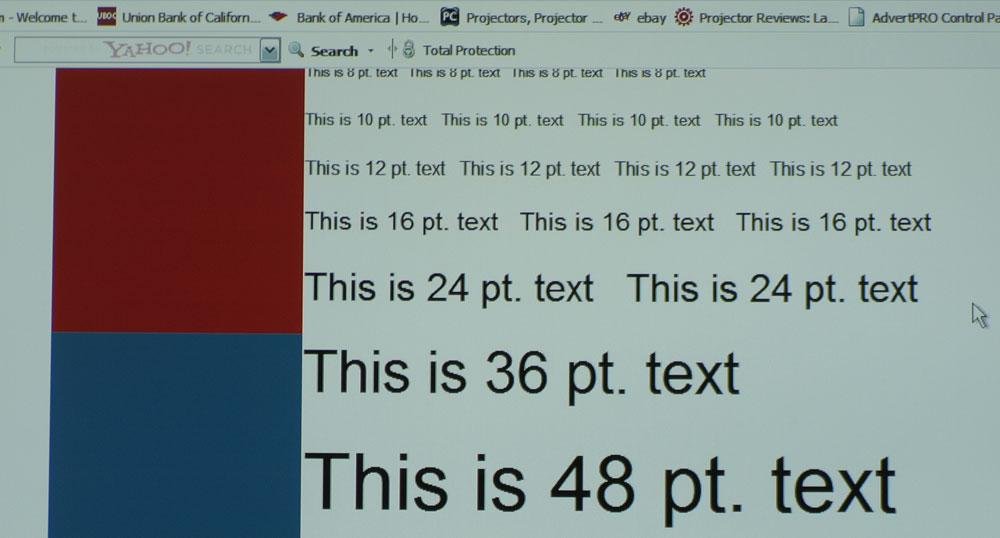
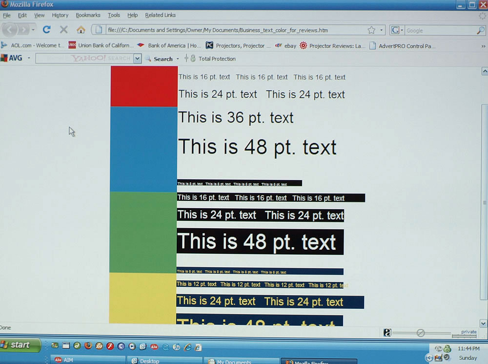
As the XJ-S57 is primarily designed for computer presentations, I connected the XJ-S57 to my laptop via the analog VGA connection and fed it at its native resolution (1024 x 768).The XJ-S57 did a great job with my standard spreadsheet of various sized and colored text, providing a sharp image down to 8 pt. text . With the Nokia monitor test text, uniformity was good across the screen and text in the corners of the image remained sharp. (Click on the image for a much larger version.)
I then switched the output of my laptop to the XJ-S57’s maximum input resolution over RGB, (1600 x 1200). A projector with good compression technology will still be able to project readable text of all sizes and colors on my spreadsheet. The XJ-S57 performed well on this test, as there was little degradation of projected text.
Switching to display of photos revealed the shortcomings of the XJ-S57. As is the case with many DLP-based data projectors, colors are somewhat subdued compared to their LCD counterparts. Greens leaned slightly toward yellow and yellows were somewhat mustardy. Overall, the colors were certainly acceptable, especially for the projector’s intended use. It should also be noted for those more interested in color presentations, that Casio sells the XJ-SC215, which is physically the same as the S57, but features Casio’s high-fidelity color rendering light engine algorithm and improved multi-segment color wheel, albeit at a reduction in light output of 500 lumens (see the section at the end of this review discussing other models in the Casio lineup).
Editor's note: Mike says above, that the Casio XJ-S57 does a great job on various sized and colored text. He is talking about the compression technology when handling different resolutions of colored text on colored backgrounds (often a challenge). Do not confuse that with other comments about the Casio's handling of color.
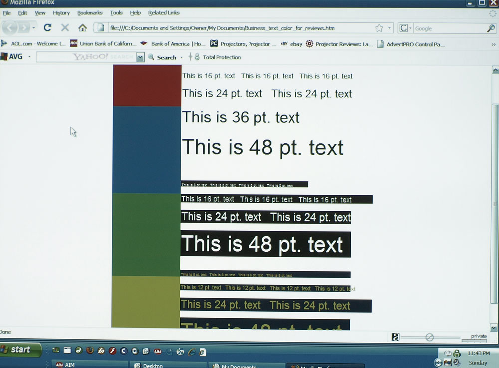
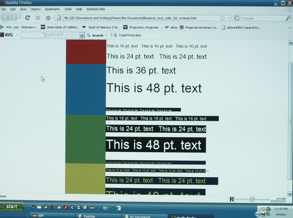
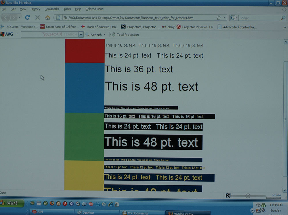
The Casio XJ-S57 is actually very typical of DLP business projectors when it comes to color handling. Most put out a lot of lumens, but most do a weak job in terms of color accuracy in their brightest modes (in this case Standard and Presentation). For those that need even good color accuracy, forget Presentation. Better is Standard, but if you want really good color - bright reds and yellows, in particular, you'll only find that in the much less bright Theatre mode. Below are three images showing the same screen in Presentation, Standard, and Theatre modes. The color bars are standard bright red, blue, green, and yellow (the three primaries, plus yellow, since yellow seems to really challenge most business DLP projectors) You can click on these for larger versions:

