- Epson Home Cinema 1080UB Home Theater Projector Review
- Projector Highlights 2
- Epson HC1080UB Home Theater Projector: Physical Tour
- Epson Home Cinema 1080UB Projector Review - Image Quality
- Epson HC1080UB Projectors: Black Levels and Shadow Detail
- Epson HC1080UB Projectors: Black Levels and Shadow Detail 2
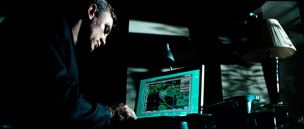
- Epson Home Cinema 1080UB - Shadow Details
- Epson Home Cinema 1080UB - Shadow Details 2
- Epson Home Cinema 1080UB - Shadow Details 3
- Epson Home Cinema 1080UB - Shadow Details 4
- Epson Home Cinema 1080UB - Shadow Details 5
- Epson Home Cinema 1080UB - Shadow Details 6
- Epson Home Cinema 1080UB - Shadow Details 7
- Epson HC1080UB Home Theater Projector: Sharpness
- HC1080UB Projector - Light Leakage
- HC1080UB Projector Measurements and Calibration
- HC1080UB Projector Measurements and Calibration 2
- Home Cinema 1080UB Measurements and Adjustments - Bottom Line
- Epson Home Cinema 1080UB Projector Warranty
- Home Theater Projector Review: Epson Home Cinema 1080UB LCD Projector: Summary, Pros, Cons
- HC1080UB projector vs. Panasonic PT-AE2000U
- Home Cinema 1080UB vs. Mitsubishi HC4900 and HC6000.
- Epson Home Cinema 1080UB projector, Pros, Cons, and Typical Capabilities
- Epson PowerLite Pro Cinema 1080UB Projector Specifications
- Home
- All Reviews
- By Category
- By Manufacturer
- Best Projectors for 2024
- Best 4K Projectors for 2023
- Best Laser TVs For 2023
- Best Short Throw Projectors For 2023
- Best Gaming Projectors For 2024
- Best Home Theater Projectors For 2024
- Best Bright Budget-Friendly Outdoor Projectors
- Best Battery Powered Outdoor Projectors
- Best Outdoor Projection Screens
- Best Projectors for 2024
- Industry News
- Reports
- Projector Manufacturers
- Manufacturer Terminology
- Manufacturers
- Recent Articles
- Custom Integration
- Projection Terms
- Projector Manufacturers Categories
- Videos
- Blog
Close
Menu
- All Reviews
- By Category
- By Manufacturer
- Best Projectors for 2024
- Best 4K Projectors for 2024
- Best Short Throw Projectors For 2024
- Best Projectors Under $1,000 For 2024
- Best Projectors Under $500 For 2024
- Best Laser TVs For 2024
- Best Gaming Projectors For 2024
- Best Home Theater Projectors For 2024
- Best Bright Budget-Friendly Outdoor Projectors
- Best Battery Powered Outdoor Projectors
- Best Outdoor Projection Screens
- Best Outdoor Projectors For 2024
- Best Projectors On Amazon In 2024
- Best Portable Projectors For 2024
- Best Projectors for 2024
- Latest News
- Reports & Guides
- Manufacturers
- Articles
- Custom Integration
- Projection Terms
close

