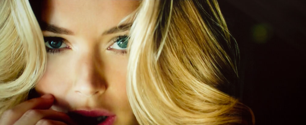
Before we discuss the picture quality of Epson's Home Cinema 2030, our usual comments on the color accuracy of the images:
A lot of processing goes on from the start of a photo shoot until you are viewing the Epson Home Cinema 2030 images on your computer screen. As a result, these images are reasonable indications, but not accurate enough for comparing precise color, saturation and other aspects.
Note: Selected images relating to shadow detail, and especially black level performance can be very effective at demonstrating how the Home Cinema 2030 positions itself compared to other home projectors. Different computers, browsers, displays, graphics cards, and software, all affect how the image looks on your screen. Most can be found in other reviews to help you compare projectors.
I've always said, that all home projectors, including this Epson Home Cinema 2030, definitely looks better live at your place, than any of our images would indicate. Note, as I often do, sometimes in the whole process, our images pick up a slight tint that isn't there when viewing the screen. In the case of the Home Cinema 2030, that slight shift is there, and it is adding some additional mostly greenish tint.
Epson Home Cinema 2030 Out of the Box Picture Quality
Out of the box picture quality would have to be considered rather good even if the HC2030 was twice the price.
There are four 2D color modes and two 3D ones. Dynamic, the brightest, is definitely a bit on the cool side but not too much. It’s very punchy as one would expect, only slightly “over the top”, the kind of “over the top” you need to cut through more than a little ambient light. Living Room is even cooler but not at all over the top! Football looks killer. Wow! While cool, adjusting the Color Temp down one warms it up a good bit, without removing very much brightness at all. Your call. Natural and Cinema are a couple/three hundred lumens less bright than Living room, and have that more Cinema feel. Both are very watchable, without adjustment. Hey, they all are, and that’s rare.
 Click Image to Enlarge
On the calibration page we discuss calibrating the Natural setting, and also adjusting the settings of Dynamic for our "quick-cal" basically an attempt to improve overall color and watchability without sacrificing significant brightness. If we wanted to sacrifice a whole lot of brightness - well, that's a full calibration!
That makes the HC2030 very LCDTV like. "No muss, no fuss." Take it home, power it up, and watch it, watch from Blu-ray and DVD players, satellite and cable, but also with internet content from Roku, and personal content such as photos, using a typical USB stick.
This is a “$1000” projector. We’ll discuss other aspects such as black level performance and shadow detail, and the effects of our calibration. But consider this a projector that can be slightly improved by our settings, but looks pretty impressive just as it is, or with the changes we suggest. Out of the box it looks better than the typical LCDTV you see at Best Buy, and those things are tweaked to add lots of pop at the expense of overall picture quality (often the mode they are in is called "showroom" or "demo".)
Epson Home Cinema 2030 Projector - Flesh Tones
Check out the images. All the HDTV based images are with default settings for Living Room unless otherwise noted. Or, for a few of them, I reduced the color temp setting by one, to warm things up.
All and all, you will likely find the skin tones to be rather good, pleasant or easy to enjoy. That’s especially nice for a near entry level 1080p projector. Certainly however, if you plug in our settings skin tones can be even more right. Watch out for that little extra greenish caste that I report ended up in the images that wasn't on the screen when photographed.
I’m not pitching this projector for the hard core enthusiast seeking color perfection. This is for the family, or the person who wants big bright and enjoyable.
The images here give you a good idea, keeping in mind of course, that all images will look different on your monitor after graphics cards, image compression the DSLR and more. Overall, I’d say these images aren’t a bad representation, although they look a touch more saturated than on the screen.
Trying our calibration settings will improve the picture, but only slightly from Natural mode. Again that's because the out of the box color is pretty impressive without playing around.
Let's look at some assorted images, starting with good examples of skin tones. Above and below, our usual suspects - Gandalf and Arwen, from Lord of the Rings, on Blu-ray. Arwen below from LOTR is a bit green. There's two reasons: That slight shift I mentioned, and that she's supposed to have a slight green caste because the image it taken in a very green forest...
Below are our three James Bond images from Casino Royale. Each has a different lighting scenario, the first - full sunlight, the second image; indoor fluorescent, and finally, filtered sunlight in the third image. And as one would expect, that causes each image of James Bond - Daniel Craig - to have different looking skin tones.

