Panasonic PT-F100NTU, PT-F100U Projectors Reviewed - Image Quality
I'm almost alway pleased with the rich, saturated, and reasonably accurate colors that LCD business projectors traditionally produce. The Panasonic F100NTU and its siblings, are, in that regard, classic LCD projectors, with great bright reds and yellows, and solid color performance throughout the color spectrum.
By comparison, business DLP projectors tend to have major problems with both bright reds and yellows - instead producing dark wine colored reds and mustardy yellows that usually have a lot of green component. Now a new generation of DLP projectors is coming out, featuring TI's Brilliant Color, which should help DLP achive parity in color handling, but we will have to see. So far, no DLP projector designed for business, that I have tested, has yet to match an LCD projector in this area, although a few have come close.
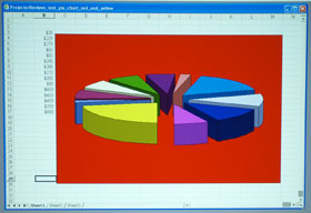
The first image is our standard Pie Chart, with a pure, bright red background, and one slice of the pie is bright yellow. The PT-F100NTU does a great job on the pie chart. Now for most presenters, if colors are just a little off, that's OK, but if you really "must have" good accuracy for your presentation, including those great reds and yellows, the Panasonic F100 series projectors are definitely up to the task.
For many, video performance, and handling of photos is equally important as text and graphics, so I took the time to view some video, and photographs on the F100NTU. While the lower contrast ratios of a business LCD projector will never make the cut for home theater quality video, the PT-F100NTU certainly has no problem tackling what I'll call business video presentations, be it a Human Resources video, a Product Marketing rollout.
Here's an image of a standard color bar, fed to the PT-F100NTU. All colors look pretty good, although green is a little off. Greens do come out very rich in reality, but sometimes oversaturated.
Switching over to photos, I took the opportunity to view on the Panasonic, the first batches of images from my new Olympus digital SLR, which I am starting to use for the review photo shoots. Checking out some family photos, DVDs and general photography, the F100NTU performed very well, within the limits of the less than great black levels of business LCD projectors.
Panasonic PT-F100NTU and F100U on handling text at different resolutions
Virtually any projector can do a respectable job in producing clear, sharp text when operating with sources that are at the projector's native resolution, which in this case is XGA (1024x768).

These Panasonic's are no exception, as you can see above. The real challenge comes when feeding different resolutions. For example, many presenters now own laptops that sport higher native resolution, such as SXGA+ (1400x1050) or UXGA (1600x1200). In addition, a large number of computers now (finally) are wide screens, with resolutions like 1280x800, 1366x768, 1440x900 or even higher.
To test the ability for projectors to produce reasonably clean, readable small type, at various resolutions, I interfaced the PT-F100NTU to both my MacBook Pro, and an Acer laptop as well.
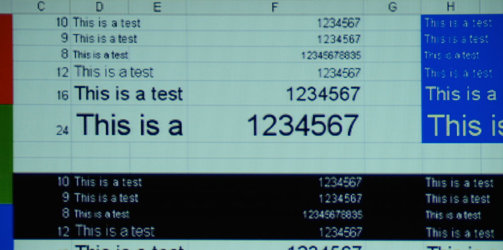
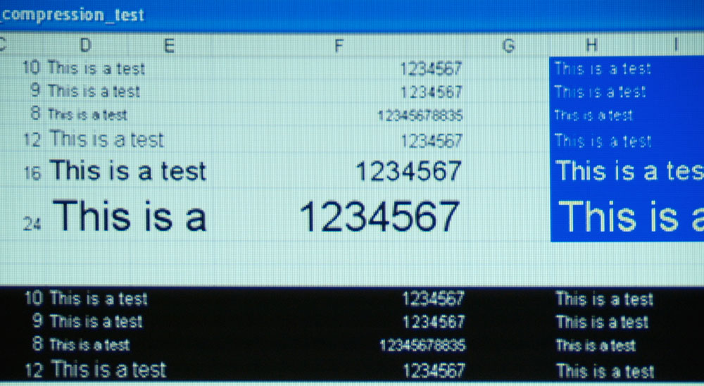
Overall, here's what I learned: the PT-F100NTU does an excellent job on compressingslightly higher resolutions (such as 1280x800), and does a respectable job
on output from my MacBook Pro at 1440x900. The Panasonic had no trouble locking onto a UXGA (1600x1200) signal, but small type (under 10 point) quickly became unreadable (as is the case with almost all XGA projectors). The F100NTU struggled at the higher compression levels with color on color, which is always more challenging than black text on white, but did surprisingly well with small white text on black (although still no match for black text on white). Click to enlarge these images.
The upper of these two is a shot of compressed text from a 1280x800 source (typical of today's widescreen laptops). The lower image is of a UXGA source (1600x1200).
In summary, Panasonic's compression algorithms are good, I would say definitely above average, and should not be a critical issue in any purchase decision.
Image sharpness of the PT-F100U and PT-F100NTU projectors
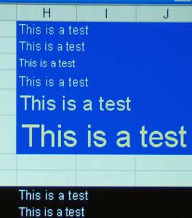
Crisp is the word. Feed these Panasonic projectors a straight XGA signal, and the picture is razor sharp.
In that I mean, if you get close you can clearly make out every pixel, and text characters - even the smallest, look beautiful, as shown here in this image from an XGA source:
Even the light yellow on blue looks extremely sharp, and these are all small font sizes, with the largest text in the image being 24 points, which is typical "body text" size in a Powerpoint presentation!
Vertical Banding
The test Panasonic PT-F100NTU does exhibit some vertical banding (normally associated with LCD projectors). This is likely to appear when subtle shading is used. From a business presentation standpoint this should be mostly, a non-issue. The image here (a close up) shows the banding in the lighter gray areas.