While most business and classroom projectors offer 6 to 8 different picture, or color, modes, the VPL-CH375 offers only 3. Also with most projectors, be they business, classroom or home theater models, the mode called "Dynamic" will usually be the brightest but providing the least accurate colors. However, with the VPL-CH375 that honor goes to its "Presentation" picture mode.
The following observations were made with the factory default settings for each picture mode.
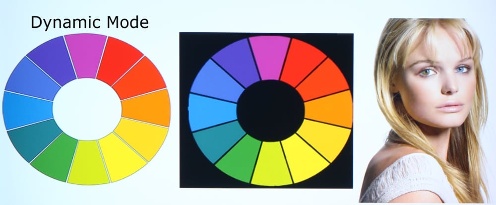
Dynamic Picture Mode produced a somewhat "cool" image with a an overall blue tint to the image. Also bright blue objects within a projected image seemed too bright, to the point of sometimes appears to glow. Greens appeared shifted a little toward yellow and magenta was a little too blue.
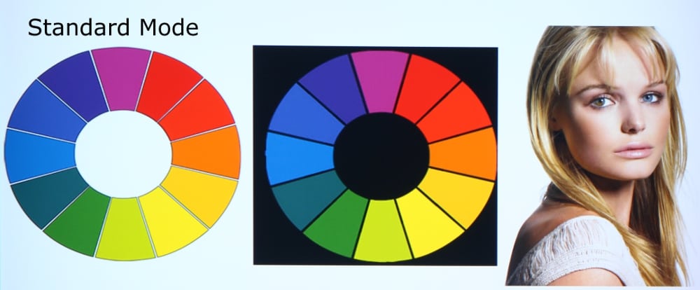
Standard Picture Mode also produced a somewhat cool image with somewhat excessive blue tint. While this picture mode was not all that much different from dynamic mode, it generally had just a little better color accuracy.
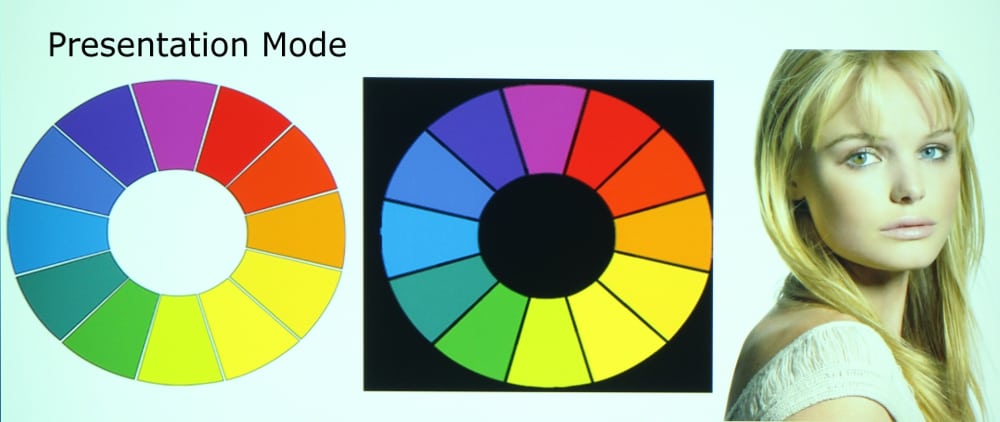
Presentation Picture Mode is the brightest mode on this projector but also with the least accurate colors. Unlike the other modes, Presentation mode has excessive green tint that many people will find less pleasing than the less pronounced blue tint of the other picture modes. Beyond this I found the colors to be somewhat less accurate in this mode as compared to the other two available picture mode. However, when maximum light output from the projector is need to deal with bright room lighting conditions, this picture mode could prove useful, especially for cases when color accuracy is not critical.
Of the three available picture modes and when using the default factory settings, I would rate Standard Picture mode as the best followed by Dynamic and Presentation picture modes. See the discussion under Video Quality below for more information.
Readibilty
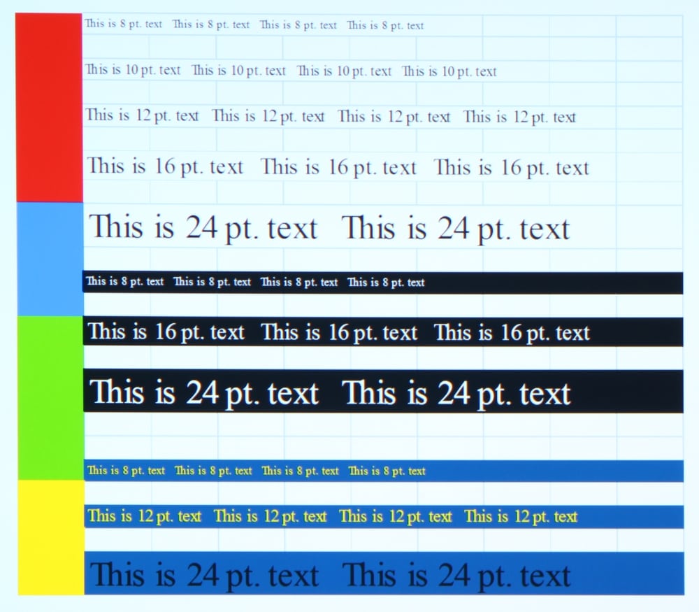
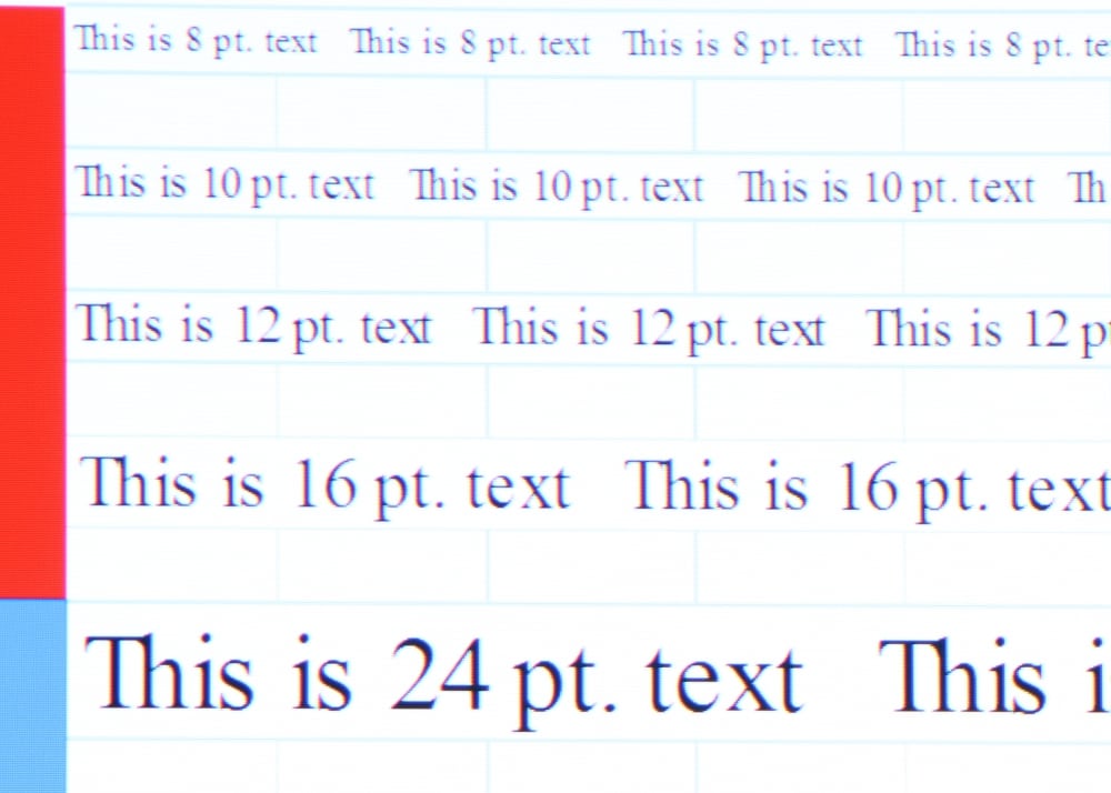
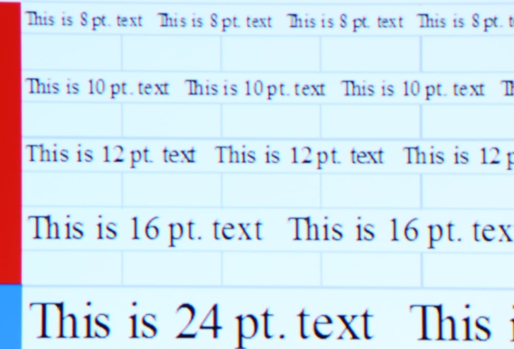
The above gallery shows the text readability when using a input signal from a PC using the projector's native 1920 x 1200 native resolution. As can be seen in the close-up photos 2 and 3 of the above gallery, even the 8 point text appears very easy to read. Some red-blue-green misconvergence was evident on the specific projector reviewed and these photos were taken without attempting to make any corrections using the projector's panel alignment adjustment.
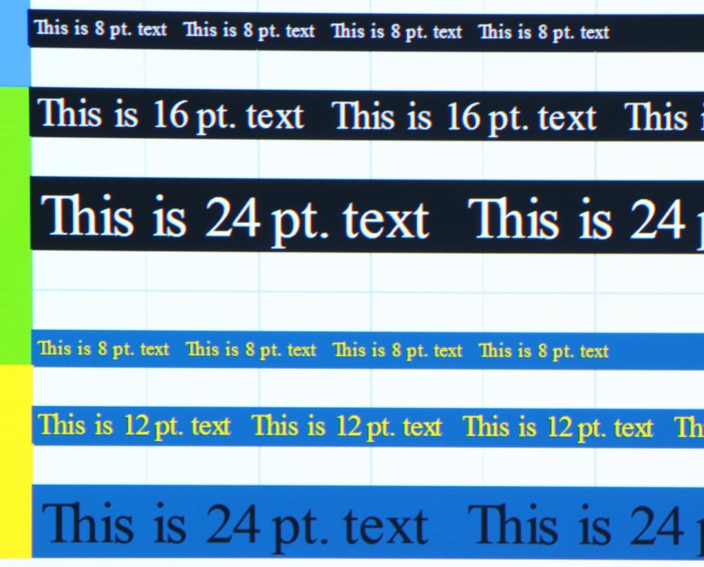
I also checked the performance in upscaling lower resolution images to the projector's higher native resolution. I connected a PC via HDMI and fed the projector these same text test images at a 1366 x 768 resolution. The projector then scaled this up and displayed it at its native UWXGA resolution. The displayed upscaled image (closeup shown below) retained good readability, but as expected it was not a sharp as when the higher resolution text image was input to the projector. I would rate the upscaling performance as good.
Upscaled Text
Video Performance
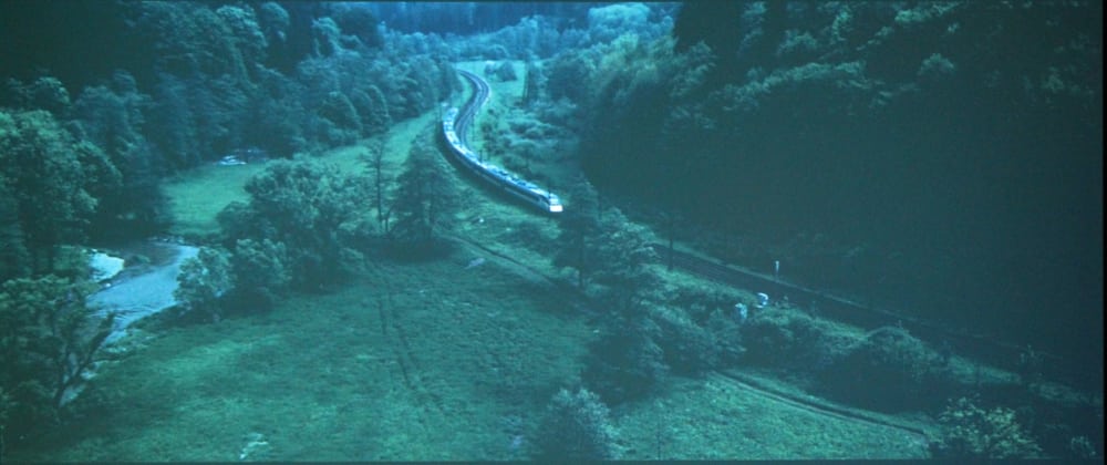
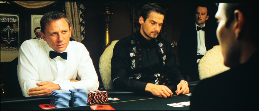
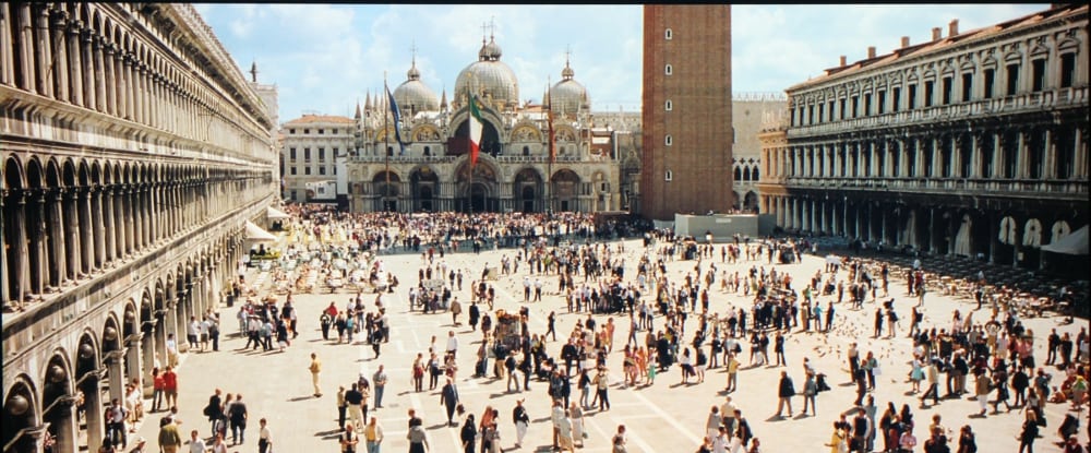
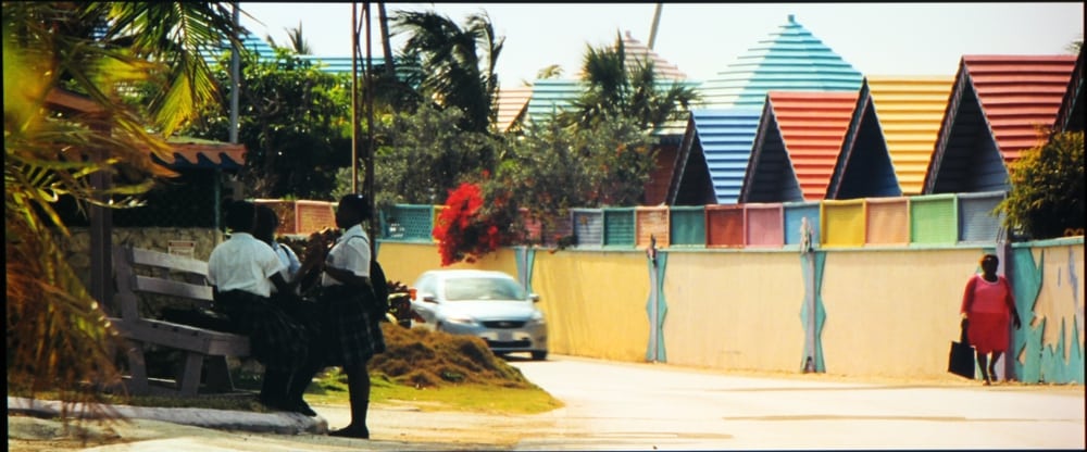
The above gallery shows screen shots taken from the movie "Casino Royale" being projected by the VPL-CH375. I used "Standard" picture mode, but changed the default Color Temperature setting to "Low". This produced a "warmer" image with more natural color balance. I found the overall performance when operated in this mode to be very good with bright well saturated colors While not a home theater class of projector for displaying video, the performance shown by this projector is well suited for its intended role for presentations in large venues and/or in environments with significant ambient lighting.