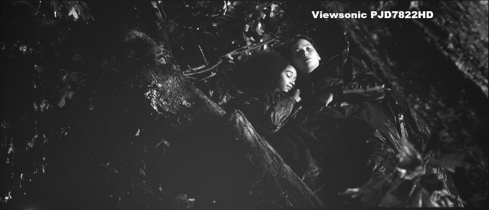
Sony VPL-HW45ES Dark Shadow Detail
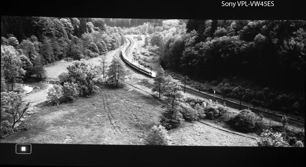
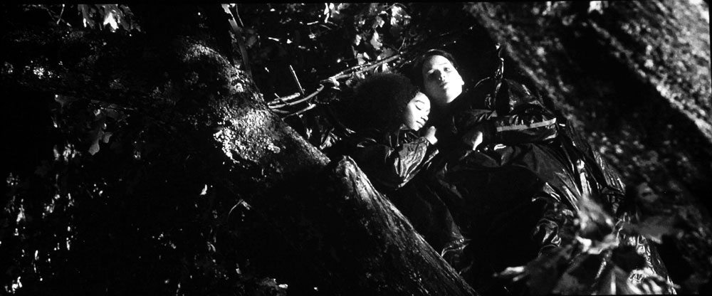
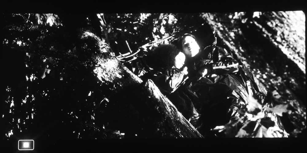
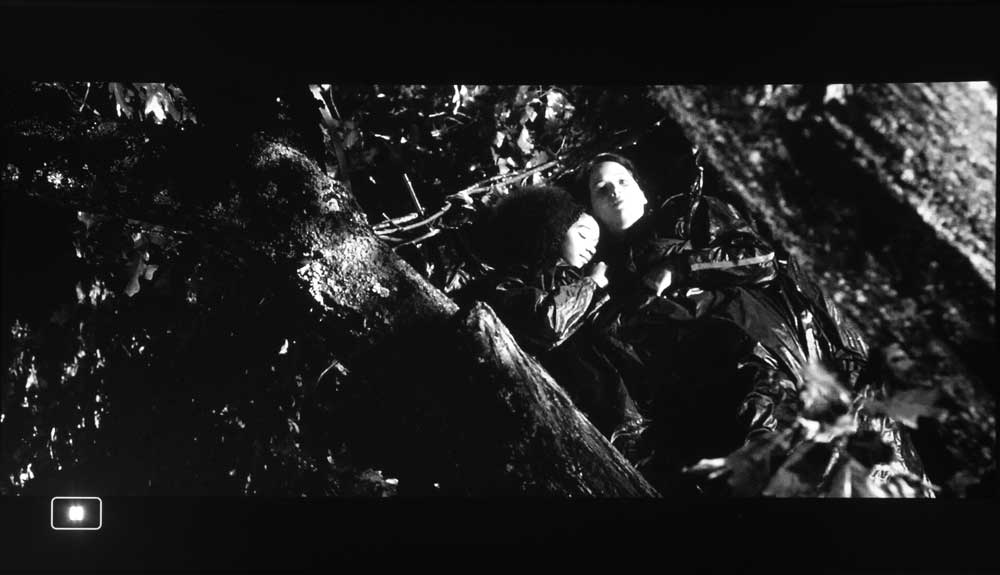
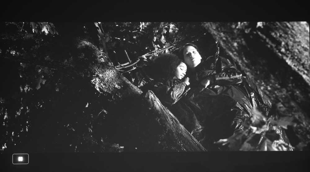
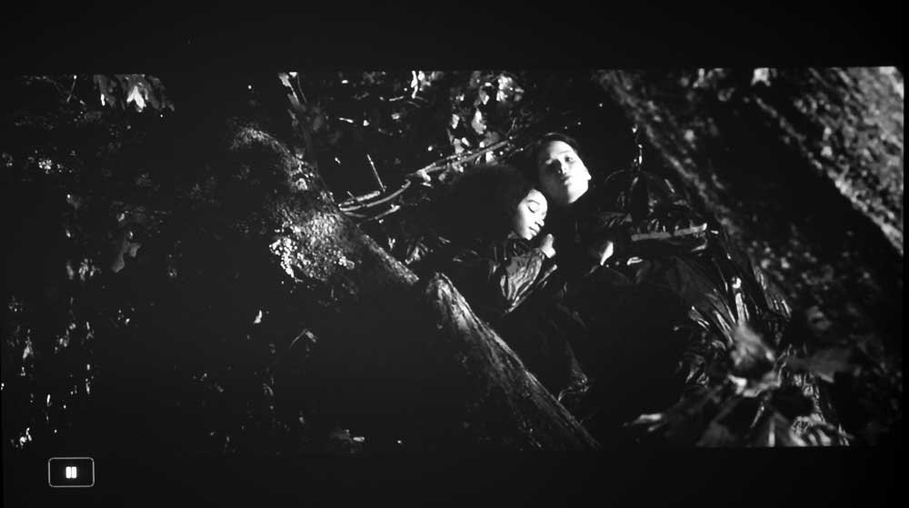
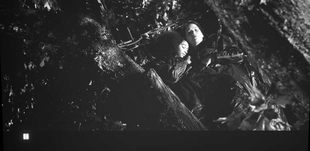
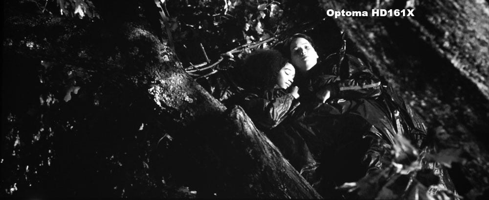
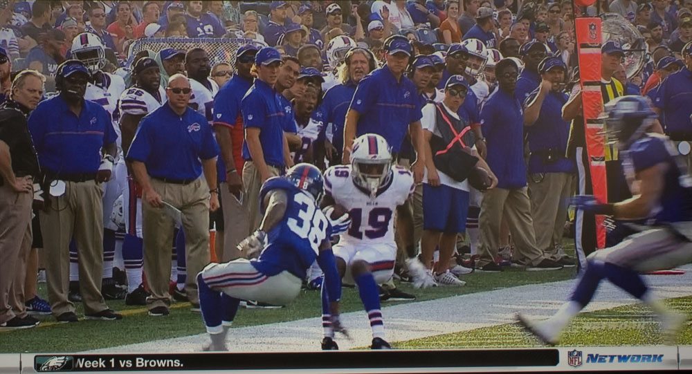
Dark shadow detail is truly excellent, that is, great. I can detect virtually no loss of the very darkest detail on the Bond night train scene, and on Katniss and Rue sleeping - our two favorite images for dark shadow detail. (Both are well way over exposed so you can make out any detail that is there).
As for the dark shadow detail, on the Bond train image, look behind the tracks on the right, especially the shrubs behind them. Also look around the darkest areas of the forest behind. You can compare the HW45ES against a number of competing projectors, with those images on the previous page, or compare the "sleeping" image look for detail in the large dark area around the bottom center. A careful inspection comparing to other projectors will reveal small details in almost black areas, that can be hard to spot (especially while watching the movie) - rather than these overexposed stills.
A particular strength of this Sony is that the Brightness control fairly fine (other controls as well). That makes it easy for the Sony to deliver its best effort at revealing the darkest details, some projectors controls are a bit coarse, causing some loss.
Sony VPL-HW45ES Projector For HDTV And Sports
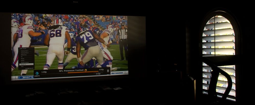
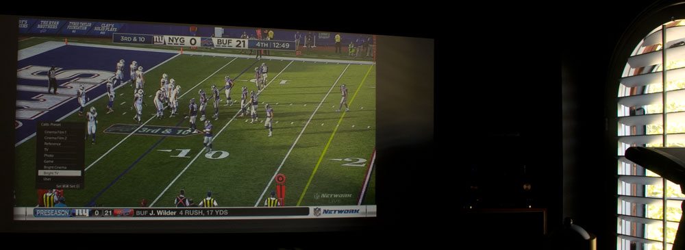
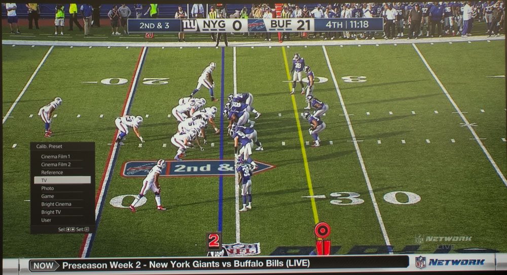
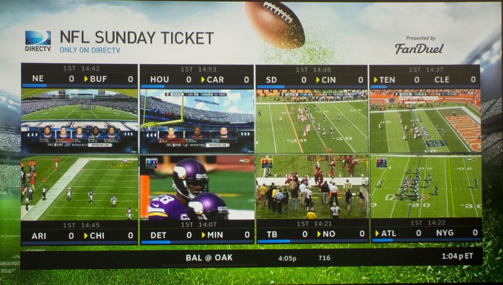
I like my sports and most HDTV viewing to be bright! True, I have a dedicated theater, but for my NFL football I usually have guests on Sundays. Most HDTV is viewed with some lighting on or, in the daytime, my window shutters are normally at least part way open, depending, (of course) on the projector de jour, and how bright it is. The first images show you the room lighting for the HDTV/sports shoot. The right side window has the shutters mostly open, while the shutters on the rear window are about half open. Plus there's ambient light from the open door to the skylight lit adjacent landing.
What you are seeing in these images represent the typical room conditions for my viewing of a lot of HDTV content, not just with this Sony HW45ES.
Almost all of the sports images were taken in Bright TV (with a couple in Bright Cinema, which is technically brighter - but doesn't look it - it is warmer and has a bit less "pop" to the image).
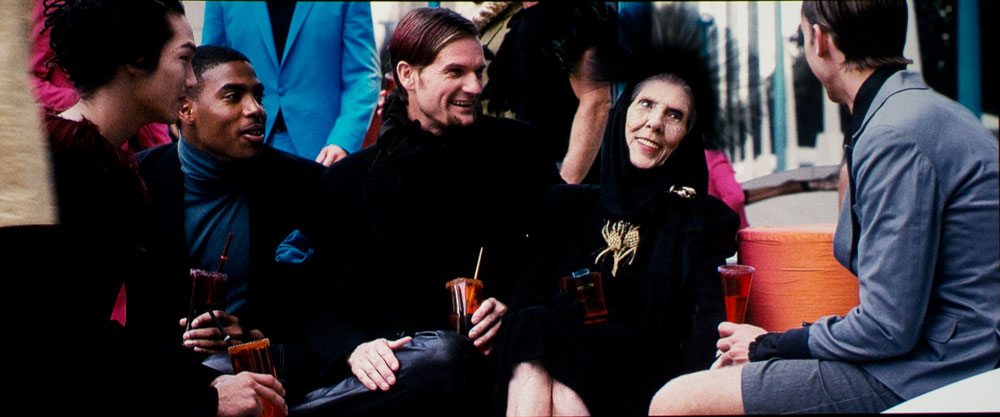
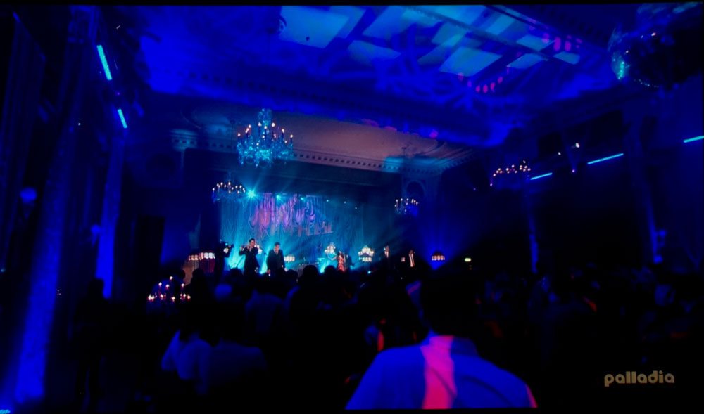
The various other HDTV images - concerts, models, Colbert, etc., were taken with the shutters closed down, still leaking ambient into the room, but low levels, not a lot as is the case with the sports images.
Overall Picture Quality: VPL-HW45ES
This Sony delivers a great picture with first class color, especially considering the reasonable price. I can't think of another sub $2000 projector with a more impressive looking picture - given it doesn't have great black levels. The rest is pretty awesome.
Here's a projector less for an enthusiast, more for a person who wants a great looking picture, but doesn't analyst why, just "watches" the content and enjoys. This ideal "person" probably won't have a perfect room, but one good enough in lighting control. Perhaps that works out to low ambient light in the daytime, but pretty darn dark at night) - aka a media room or well thought out living room. My old great room in my last house (with dark rust colored walls and motorized blinds), would have been perfect for this HW45ES!
All that said, there are enthusiasts, who will, for good reasons, buy the HW45ES. Many of those, however, would spend at least $1000 more for the Epsons, JVCs and the higher end Sonys out there, if their budget allowed.
A reminder: The images in these players are 1000 pixels wide if you expand them to full screen, that’s barely half of the horizontal 1920 pixels across of this projector’s resolution. Thus, these images are just a bit more than 1/4th the true resolution of the projected image, so expect a whole lot more sharpness when live viewing the Sony VPL-HW45ES projector.
As previously covered, color is excellent right out of the box. The basic story is that the HW45ES is a great overall performer that has a very natural looking picture. The image is sharp, with additional processing using Sony’s Reality Creation detail enhancement, providing an even sharper seeming image than without Evenness of illumination is very good, but with a slight brightening in the corners (very minor - you'll notice on a solid background, but not normally with regular content). BTW, JVC's LCoS projectors (starting at 2X the price of this Sony, tend to be even brighter in the corners.
As with the more expensive HW65ES, there is some blooming around bright areas on a dark background, more than I see on Sony’s higher end projectors that have better optics, but an acceptable amount for sub-$4000 projectors. I would have said that this Sony has slightly less blooming than Epson's 5030UB which was the most direct competitor of the older HW40ES. But the new optics on the Epson 5040UB are much better, with significantly less blooming (but, in fairness, the new Epson is a $1000 more expensive projector than this Sony).
At $1999 this is the overall picture quality to beat.
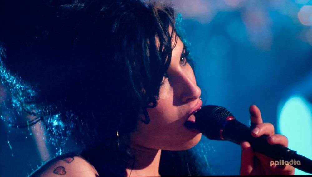
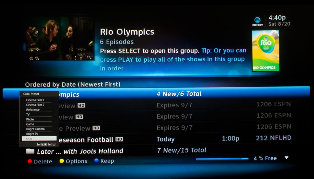
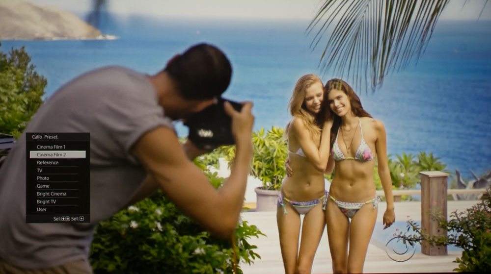
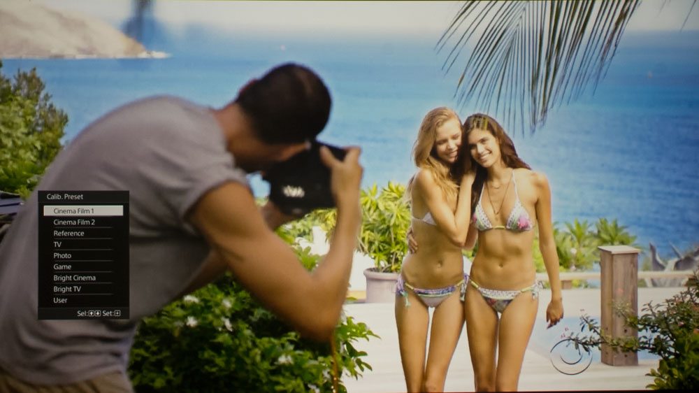
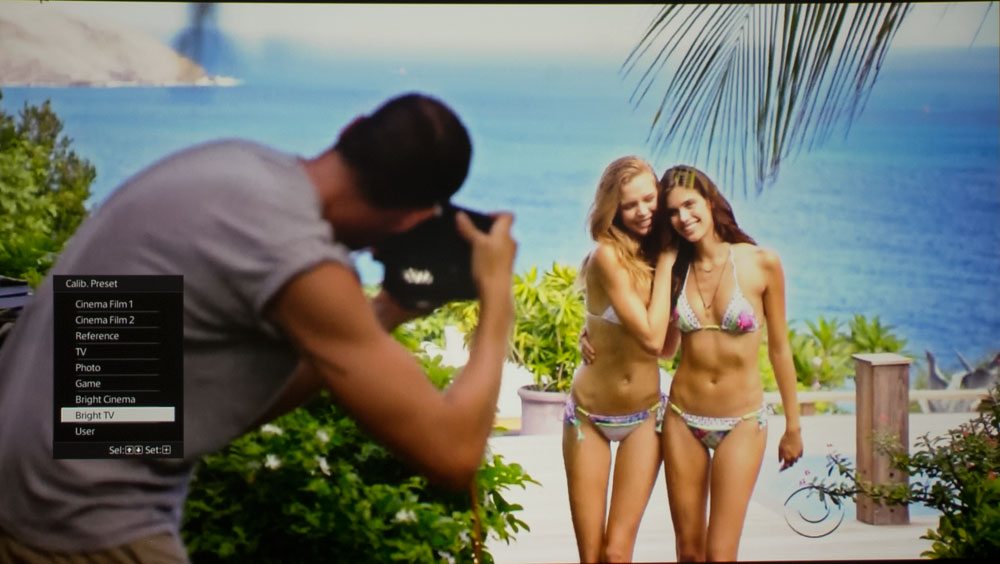
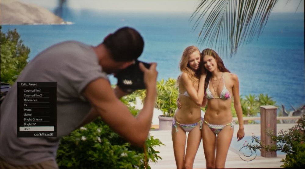
Mode Comparisons
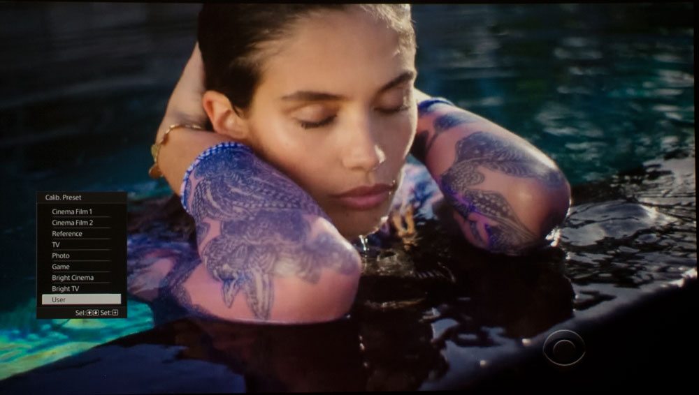
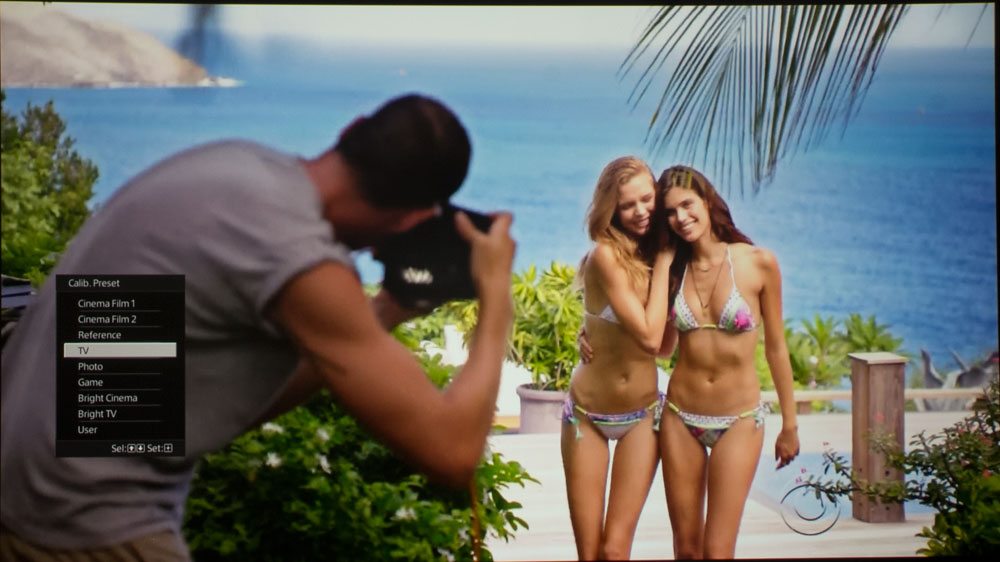
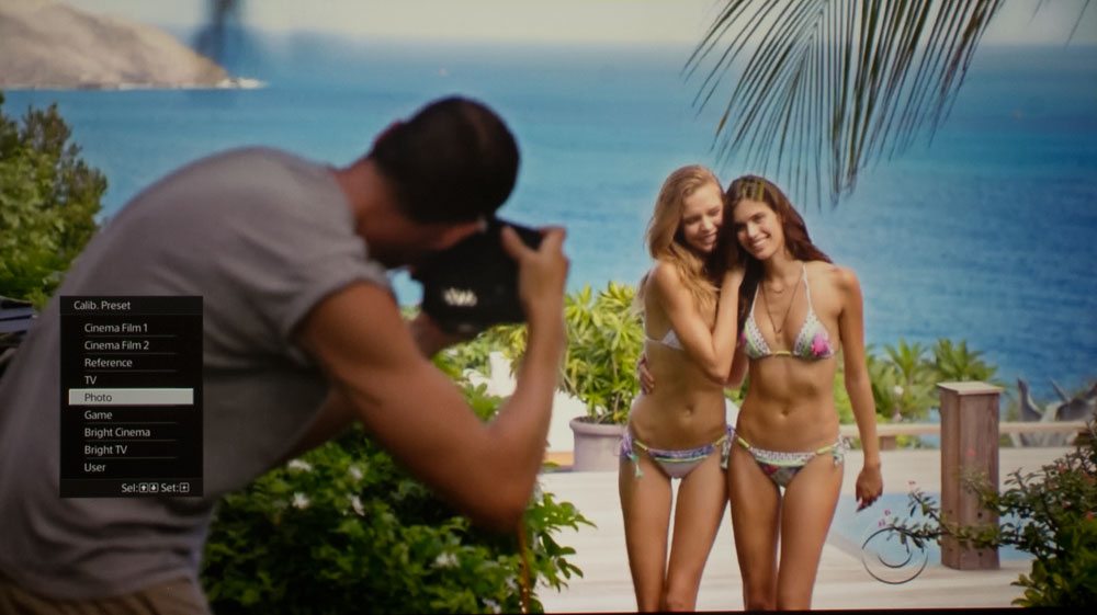
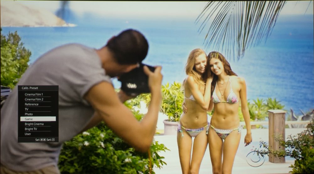
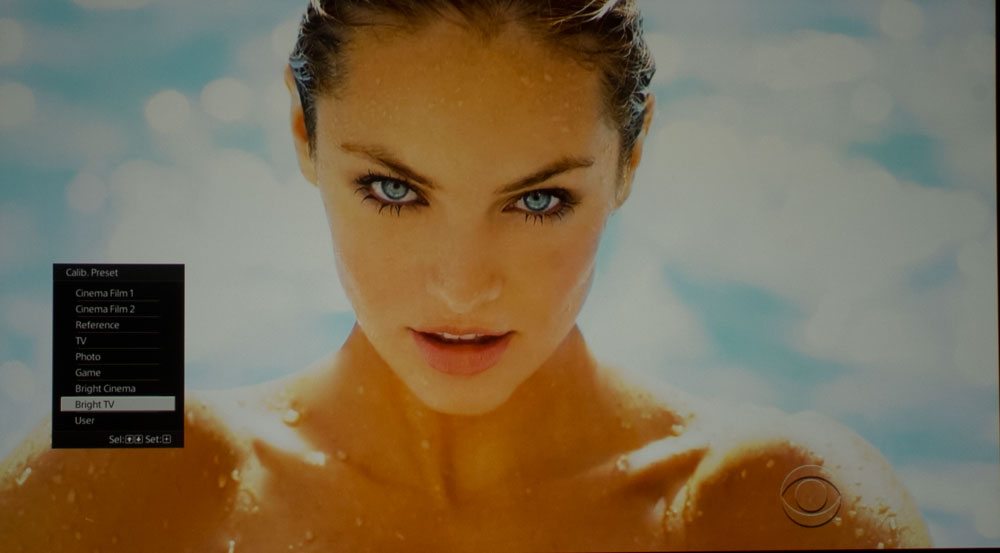
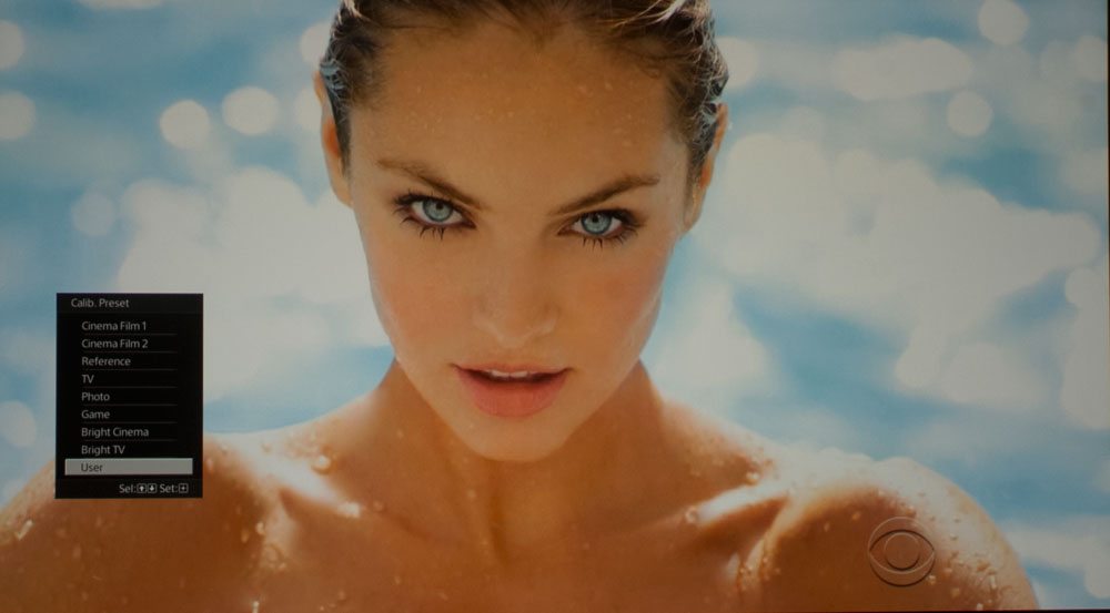
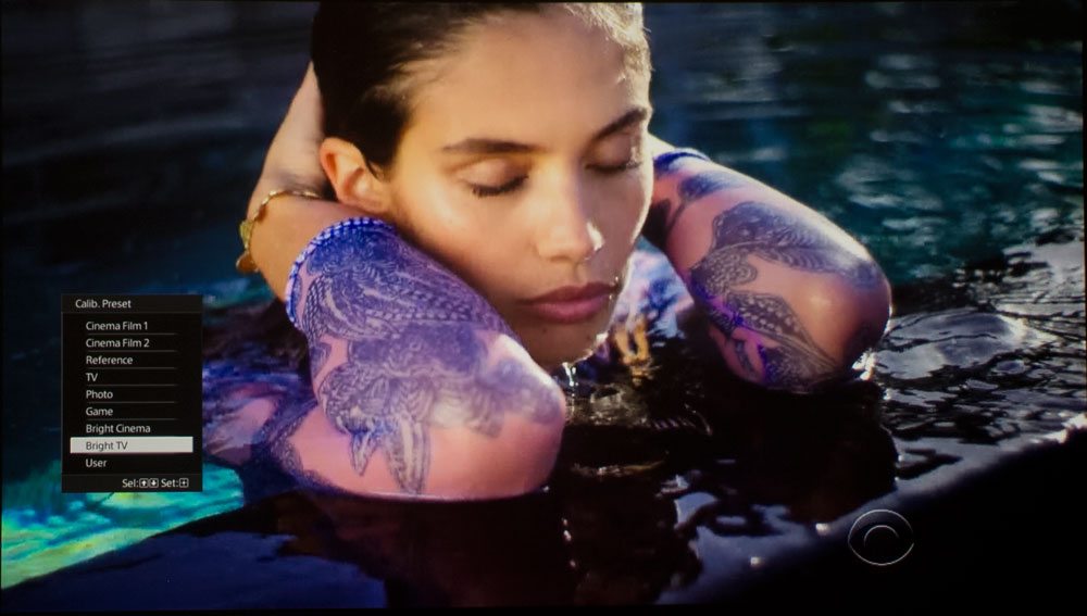
Below, you can compare the same photo, taken in many of the different modes Sony offers up. You can tell which mode, by the menu in the pictures in the lower left corner.
If, for example, the menu has Bright TV selected, then you are seeing that mode in that photo. For the main batch - swimsuit models (Victoria Secret Swimsuit Show), all the images were taken with the same exposure so you also get an idea of relative brightness. Game is the brightest measured mode, which is why that photo definitely looks overexposed.
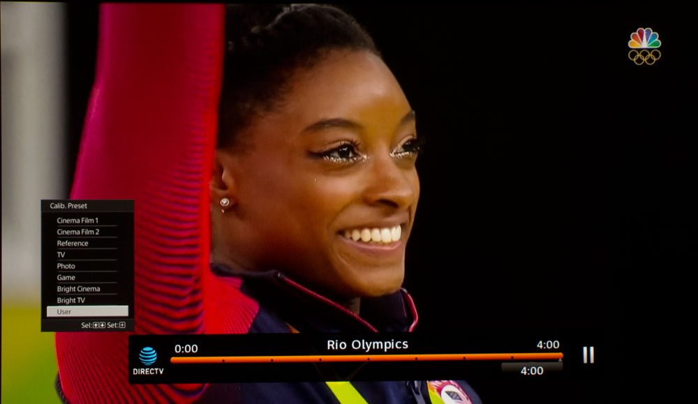
But the real magic is in the last four images below.
But before we do the last four, the two model pairs above them, show Bright TV and then User (calibrated, based on Reference). Big difference in the naturalness.
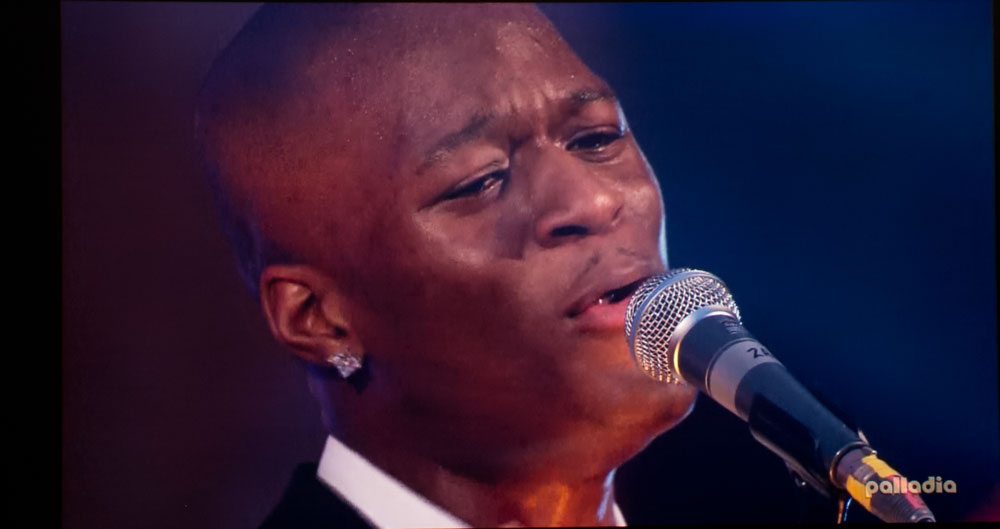
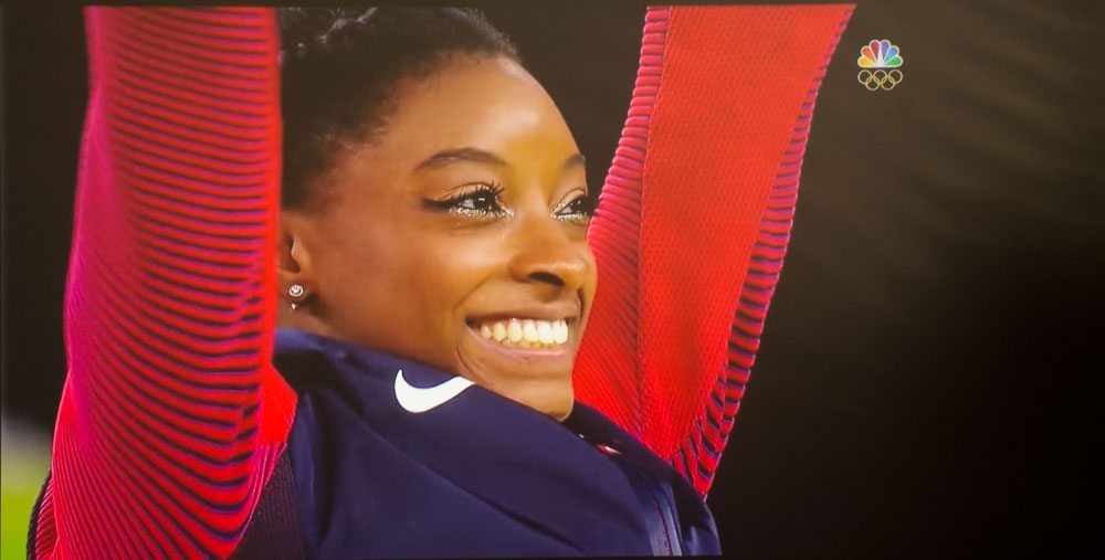
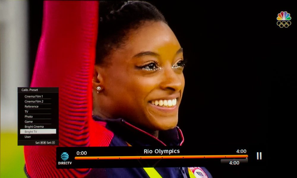
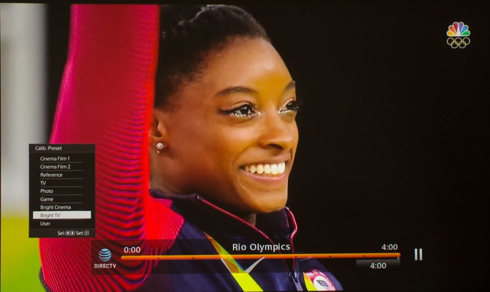
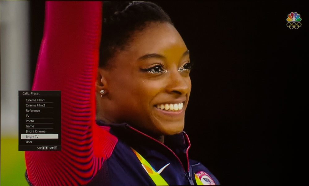
Now look at the four images at the end of Simone Biles the US Olympic gold-medal-winning Gymnast.
The first image has great skin tones, that is from the Calibrated mode (User).
The second image shows Bright TV, with the same low levels of ambient light. It's not only a bit brighter, but skin tones are too red and more contrasty. As I like to say: "A bit over the top." But just fine for viewing sports, I figure!
Now it gets interesting. The 3rd image was taken exactly like the second, but I allowed more ambient light into the room. Notice that the same tendencies are there as the image before it, but because the ambient wipes out some of that contrast, it looks a bit less "over the top," if still far more like the 2nd image than the first one.
Finally, the point of all of this: The last image is still Bright TV, and it's still with the increased ambient light, but this time I've adjusted the exposure so it's very close to the first (the calibrated) photo.
But it no longer really seems particularly over the top at all, compared to the first image. By reducing the brightness (since images 2 and 3 were too bright to begin with) on image four, you can see how the addition of additional ambient light makes Bright TV seem ore like a "best" mode, such as the calibrated User (Reference).
And that folks is the justification for watching using Bright TV or Bright Cinema when you have more than minimal ambient light. And, it's because Sony intended those modes to look best with ambient light present. Nice!