- JVC DLA-RS6710U, RS67U, X900R, 4K Home Theater Projector Review
- JVC DLA-RS6710U Projector Review - Special Features
- JVC DLA-RS6710 Projector Review - Hardware Tour
- JVC DLA-RS6710 Projector Review - Hardware 2
- JVC DLA-RS6710 Projector Review - Hardware 3
- JVC DLA-RS6710, RS67U and X900R - Picture Quality
- JVC DLA-RS6710, RS67U, X900R Picture Quality 2
- JVC DLA-RS6710 Projector Review - Performance
- JVC DLA-RS6710 Projector Review - Performance 2
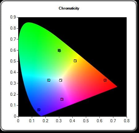
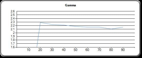
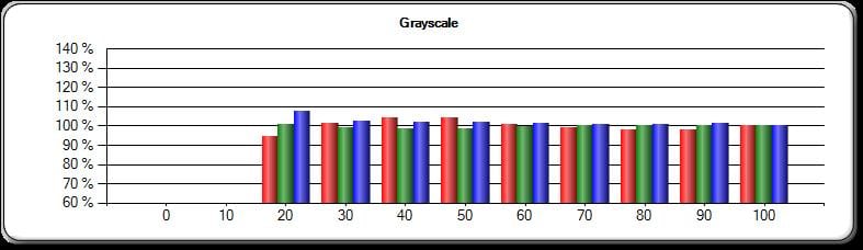
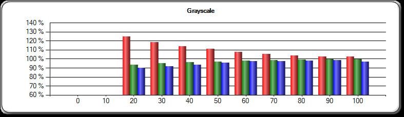
- JVC DLA-RS6710 Projector Review - Calibration and Settings
- JVC DLA-RS6710 Projector Review - Advanced Calibration Information
- JVC DLA-RS6710, RS67U, X900R Projector Review Summary
- JVC DLA-RS6710, RS67U, X900R Projector Review Summary 2
- JVC DLA-RS6710U 4K Home Theater Projector - Specifications
- Home
- All Reviews
- By Category
- By Manufacturer
- Best Projectors for 2024
- Best 4K Projectors for 2023
- Best Laser TVs For 2023
- Best Short Throw Projectors For 2023
- Best Gaming Projectors For 2024
- Best Home Theater Projectors For 2024
- Best Bright Budget-Friendly Outdoor Projectors
- Best Battery Powered Outdoor Projectors
- Best Outdoor Projection Screens
- Best Projectors for 2024
- Industry News
- Reports
- Projector Manufacturers
- Manufacturer Terminology
- Manufacturers
- Recent Articles
- Custom Integration
- Projection Terms
- Projector Manufacturers Categories
- Videos
- Blog
Close
Menu
- All Reviews
- By Category
- By Manufacturer
- Best Projectors for 2024
- Best 4K Projectors for 2024
- Best Short Throw Projectors For 2024
- Best Projectors Under $1,000 For 2024
- Best Projectors Under $500 For 2024
- Best Laser TVs For 2024
- Best Gaming Projectors For 2024
- Best Home Theater Projectors For 2024
- Best Bright Budget-Friendly Outdoor Projectors
- Best Battery Powered Outdoor Projectors
- Best Outdoor Projection Screens
- Best Outdoor Projectors For 2024
- Best Projectors On Amazon In 2024
- Best Portable Projectors For 2024
- Best Projectors for 2024
- Latest News
- Reports & Guides
- Manufacturers
- Articles
- Custom Integration
- Projection Terms
close