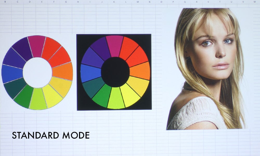
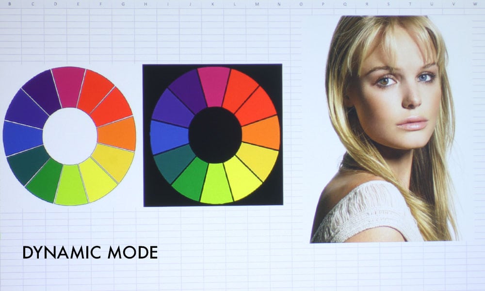
This Sony has some of the best color I’ve seen all year on a business and education projector. That’s usually a remark earned only by Epson projectors from me, but I am truly impressed with each color mode on the Sony VPL-FHZ61. All four modes are quite usable. They are: Dynamic, Standard, Brightness Priority, and Multi Screen. Dynamic and Standard are the two best modes, and are quite similar in color.
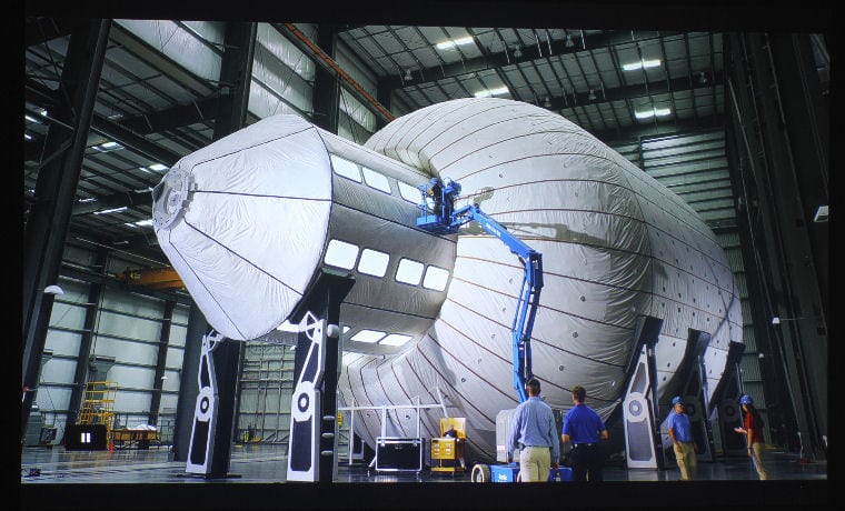
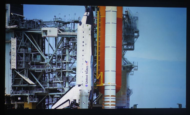
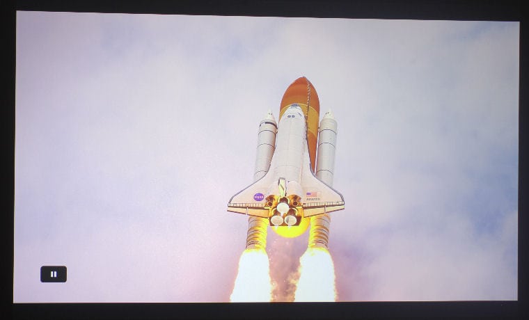
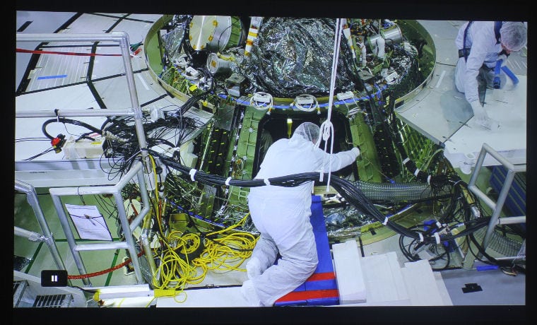
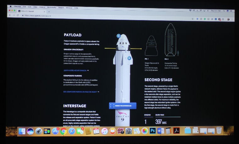
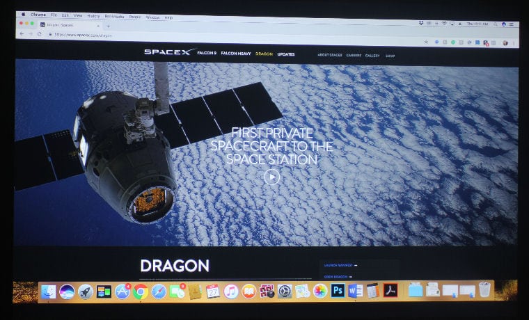
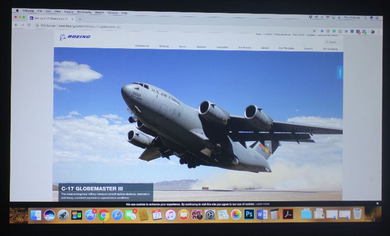
Dynamic is the brighter of the two, and produces a more vibrant image that looks excellent when projecting presentation slides and websites. Standard has a slightly warmer tone – and I mean slight – and is most suitable for videos and educational films, in cases where there is some control over ambient light. For instances where there’s a lot of ambient light, Dynamic will do just fine. I have an image of a webpage from the SpaceX website being projected in Dynamic Mode in a fully darkened room stacked with the same image being projected in Dynamic in the face of a lot of ambient light on the next page.
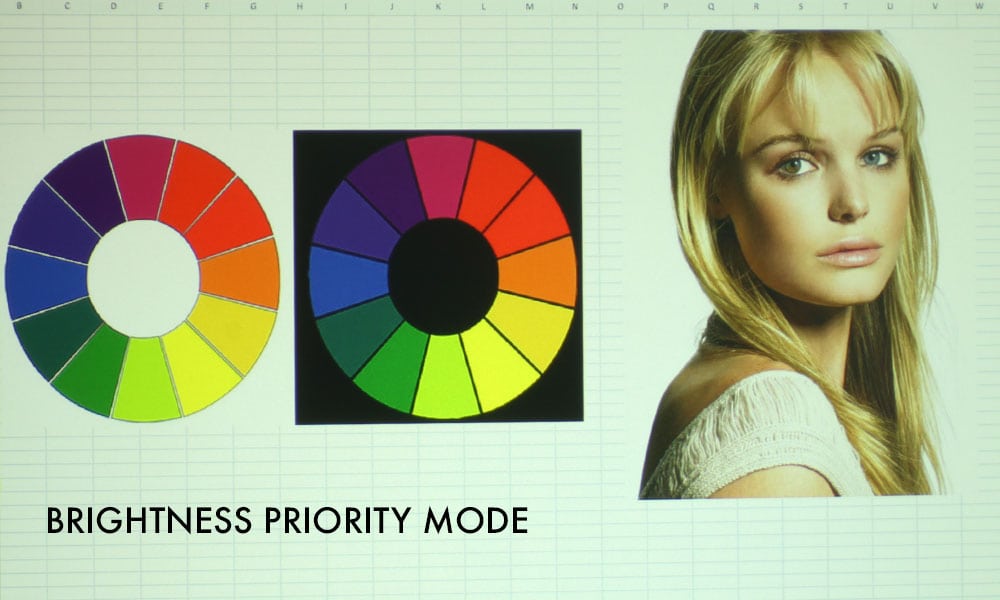
Brightness Priority Mode is the brightest mode, and has pretty good color for a bright mode! The picture in the slider above doesn’t really do it justice – it is much less green in reality. True, it does favor more of a green-yellow tint, as is typical of bright modes, but it is certainly good enough to use in the most dire of ambient light circumstances without sacrificing too much in terms of color. The final mode is Multi Screen, which resembles most projectors’ Blackboard Modes, in that it has a distinct magenta hue, but it still looks pretty great even though whites are more rosy than white.