Projector Reviews Images

Sony VPL-VW885ES 4K Laser Projector Review - Picture Quality 1

Posted on September 1, 2017 by Art Feierman

Sony VPL-VW885ES 4K Laser Projector Review - Picture Quality 1: Out-of-the-Box Picture Quality, Skin Tones, HDTV and Sports

All kinds of features are nice, or important, but at the end of it all, people don’t drop $25,000 for a projector unless they are expecting some rather amazing picture quality. At the moment, this would seem to be the finest projector under $25K, when it comes to picture quality.

True, we didn’t calibrate the projector, but the combination of the advantages of a laser light engine in terms of color handling, plus true 4K resolution, some impressive black level performance, the usual Sony image processing, and some pretty good brightness, works for me.

I watched 4K movies extensively, most were widescreen so I got to use the full width of my 124” Stewart Studiotek 130 screen (2.35:1 aspect ratio).

Out-of-the-Box Picture Quality

Well, out of the box is all we looked at, in as much as we did not have time to calibrate this projector. I don’t believe all the color tables were finalized yet, because Cinema Film 1 and 2 seemed the same, whereas normally, on other Sony projectors, they are a bit different. Still, I watched Cinema Film 1, Reference, and Bright Cinema extensively, and also a bit of Bright TV.

Reference looked the best in the sense of most faithful reproducer of the content, but Cinema Film 1 was set to have a bit more pop to the image. Bright Cinema had even more pop, so it was a good bit better on tackling ambient light, even if that mode really isn’t any brighter than the others.

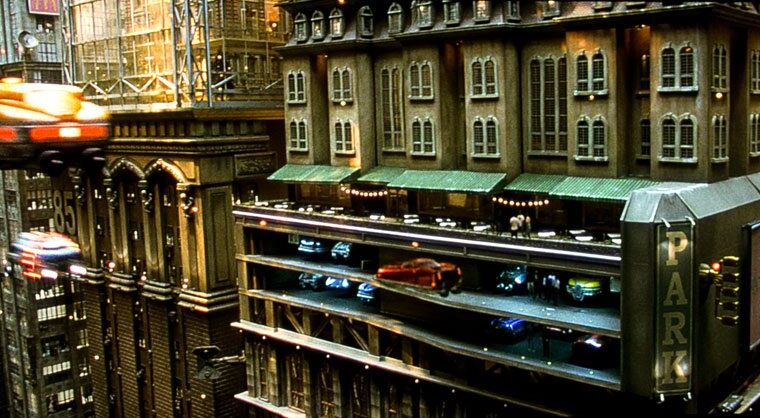
The images on this page: If you are looking at a photo of a 4K movie (HDR, BT2020), those photos will be either Reference or Bright Cinema mode. Other than in sequences where I’m showing all the different modes on the same scene, those were the only two modes used for the 4K movies, or, for that matter, the 1080p ones.

For the most part, I didn’t shoot many 1080p Blu-ray images, sticking mostly to 4K movies. The major exception being the usual Casino Royale photos of Bond under different lighting, and a few other shots from that movie. Any others are where I shot the same scene on 4K and 1080p.

For HDTV, a few of the images are Reference, but the bulk of them are Cinema Film 1, or Bright Cinema. There are, I think, only a couple of sports images shot in Bright TV. I found that mode to be a bit too cool, even though I like some extra blue (or less red) in my sports viewing vs movie viewing. That tends to help when there’s ambient light present, and when I’m watching sports, there always is.

Skin Tones

Very, very close to on the money. Yes, Reference (and Bright Cinema) would improve further (slightly) from a proper calibration, but this Sony’s color starts out almost as good as many projectors do, post calibration.

So, check out our sequences of images showing the different modes handling the same photo. After that sequence, there are a number of assorted photos showing off skin tones from movies and HDTV.

As is usual, the process of capturing these screen images with my Canon DSLR, cropping and compressing way down for web size files, as well as any limitations of your own display, may result in images your viewing that fall well short of what is seen on the screen. In addition, there is still some significant color-shifting to be expected. As to image color saturation, adjust your display so that it looks right – as it did on the screen. 

In other words, find these images useful, but only to a point in determining the projectors image quality. If you think these images look good, the problem is that it’s going to be near impossible to imagine how much better the projector looks in real life. So, also consider these images as to a large part being as entertainment for you.

The four images of Daniel Craig as Bond are our usual 1080p demonstration of how different lighting, and the director's intent affects the actual look and color.

Overall, this pre-production VW885ES was a little off on skin tones in Reference mode. I found it to be a touch too strong on red, but with a touch, perhaps, of magenta in there. Close, though – I’m being picky. Certainly, the error in capturing the image and presenting it to you results in an image that’s off more than the projector itself is, and that tendency in terms of color, just doesn’t show up in the photos.

HDTV and Sports

The Sony is the full package here. With more than a little ambient light present, I like Bright Cinema. Again, if you want a bit more blue in the picture, try Bright TV, but my preference is definitely for Bright Cinema for my football games.

For general viewing of TV programs, I watch Game of Thrones in a pretty dark room, so stick to Cinema Film 1. But for most other shows I allow for more ambient light, and depending, opt for Bright Cinema when there’s more than a little.

For the moment, of course, almost everybody is watching their HDTV as HDTV, not 4K. When you are merely watching content at 1080i or 720p, as is provided by my DirecTV box, remember that you will lose much of the advantage of the projector being a true 4K display.

I find that the 4K UHD projectors, despite their larger pixels than true 4K, typically look as sharp, or sharper than the Sony. That’s no surprise because the Sony is still a 3 chip device, so there’s always a touch of misalignment that a single chip DLP doesn’t have to suffer. (Of course, there’s no rainbow effect with the Sony, whereas I do see the occasional rainbow with any of the 4K UHD projectors).

Sony has some of the nicest creative frame interpolation available. I don’t use CFI for the most part, except for sports, and even then I favor the lower settings. I consider that to be a personal preference, but Sony’s different settings give you choices and are about as good (or better) than most.

Sony VPL-VW885ES 4K Laser Projector Review - Picture Quality 1: Out-of-the-Box Picture Quality, Skin Tones, HDTV and Sports

All kinds of features are nice, or important, but at the end of it all, people don’t drop $25,000 for a projector unless they are expecting some rather amazing picture quality. At the moment, this would seem to be the finest projector under $25K, when it comes to picture quality.

True, we didn’t calibrate the projector, but the combination of the advantages of a laser light engine in terms of color handling, plus true 4K resolution, some impressive black level performance, the usual Sony image processing, and some pretty good brightness, works for me.

I watched 4K movies extensively, most were widescreen so I got to use the full width of my 124” Stewart Studiotek 130 screen (2.35:1 aspect ratio).

Out-of-the-Box Picture Quality

Well, out of the box is all we looked at, in as much as we did not have time to calibrate this projector. I don’t believe all the color tables were finalized yet, because Cinema Film 1 and 2 seemed the same, whereas normally, on other Sony projectors, they are a bit different. Still, I watched Cinema Film 1, Reference, and Bright Cinema extensively, and also a bit of Bright TV.

Reference looked the best in the sense of most faithful reproducer of the content, but Cinema Film 1 was set to have a bit more pop to the image. Bright Cinema had even more pop, so it was a good bit better on tackling ambient light, even if that mode really isn’t any brighter than the others.

The images on this page: If you are looking at a photo of a 4K movie (HDR, BT2020), those photos will be either Reference or Bright Cinema mode. Other than in sequences where I’m showing all the different modes on the same scene, those were the only two modes used for the 4K movies, or, for that matter, the 1080p ones.

For the most part, I didn’t shoot many 1080p Blu-ray images, sticking mostly to 4K movies. The major exception being the usual Casino Royale photos of Bond under different lighting, and a few other shots from that movie. Any others are where I shot the same scene on 4K and 1080p.

For HDTV, a few of the images are Reference, but the bulk of them are Cinema Film 1, or Bright Cinema. There are, I think, only a couple of sports images shot in Bright TV. I found that mode to be a bit too cool, even though I like some extra blue (or less red) in my sports viewing vs movie viewing. That tends to help when there’s ambient light present, and when I’m watching sports, there always is.

Skin Tones

Very, very close to on the money. Yes, Reference (and Bright Cinema) would improve further (slightly) from a proper calibration, but this Sony’s color starts out almost as good as many projectors do, post calibration.

So, check out our sequences of images showing the different modes handling the same photo. After that sequence, there are a number of assorted photos showing off skin tones from movies and HDTV.

As is usual, the process of capturing these screen images with my Canon DSLR, cropping and compressing way down for web size files, as well as any limitations of your own display, may result in images your viewing that fall well short of what is seen on the screen. In addition, there is still some significant color-shifting to be expected. As to image color saturation, adjust your display so that it looks right – as it did on the screen. 

In other words, find these images useful, but only to a point in determining the projectors image quality. If you think these images look good, the problem is that it’s going to be near impossible to imagine how much better the projector looks in real life. So, also consider these images as to a large part being as entertainment for you.

The four images of Daniel Craig as Bond are our usual 1080p demonstration of how different lighting, and the director's intent affects the actual look and color.

Overall, this pre-production VW885ES was a little off on skin tones in Reference mode. I found it to be a touch too strong on red, but with a touch, perhaps, of magenta in there. Close, though – I’m being picky. Certainly, the error in capturing the image and presenting it to you results in an image that’s off more than the projector itself is, and that tendency in terms of color, just doesn’t show up in the photos.

HDTV and Sports

The Sony is the full package here. With more than a little ambient light present, I like Bright Cinema. Again, if you want a bit more blue in the picture, try Bright TV, but my preference is definitely for Bright Cinema for my football games.

For general viewing of TV programs, I watch Game of Thrones in a pretty dark room, so stick to Cinema Film 1. But for most other shows I allow for more ambient light, and depending, opt for Bright Cinema when there’s more than a little.

For the moment, of course, almost everybody is watching their HDTV as HDTV, not 4K. When you are merely watching content at 1080i or 720p, as is provided by my DirecTV box, remember that you will lose much of the advantage of the projector being a true 4K display.

I find that the 4K UHD projectors, despite their larger pixels than true 4K, typically look as sharp, or sharper than the Sony. That’s no surprise because the Sony is still a 3 chip device, so there’s always a touch of misalignment that a single chip DLP doesn’t have to suffer. (Of course, there’s no rainbow effect with the Sony, whereas I do see the occasional rainbow with any of the 4K UHD projectors).

Sony has some of the nicest creative frame interpolation available. I don’t use CFI for the most part, except for sports, and even then I favor the lower settings. I consider that to be a personal preference, but Sony’s different settings give you choices and are about as good (or better) than most.

© 2024 Projector Reviews

crossmenu linkedin facebook pinterest youtube rss twitter instagram facebook-blank rss-blank linkedin-blank pinterest youtube twitter instagram