Welcome to the picture quality page. Here I will go through the aaxa 4k1 Mini projector color modes, video quality and note how it performs with text and presentations. Many are driven to purchase a 4k display for the huge upgrade in resolution and clarity of the image. 4K content looks so crisp and detailed. The aaxa 4k1 delivers a good image and great 4k resolution.
Standard picture mode with Eco brightness
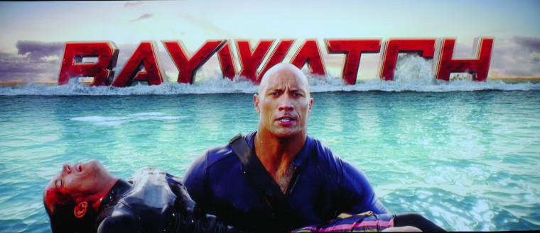
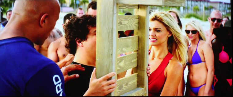
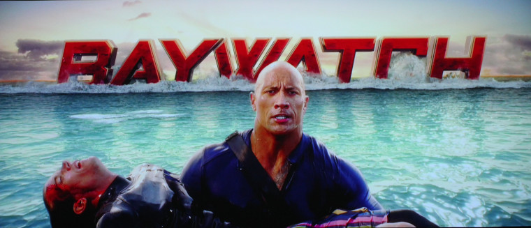
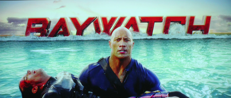
Standard picture mode with Normal brightness. You can see the increased red in the skin tones and Baywatch logo. As well as greens as the water tint has changed.
Standard Picture mode with Boost Brightness. The Greens and Reds are heavily driven. The skin tones are very green with deep red highlights.
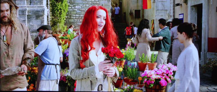
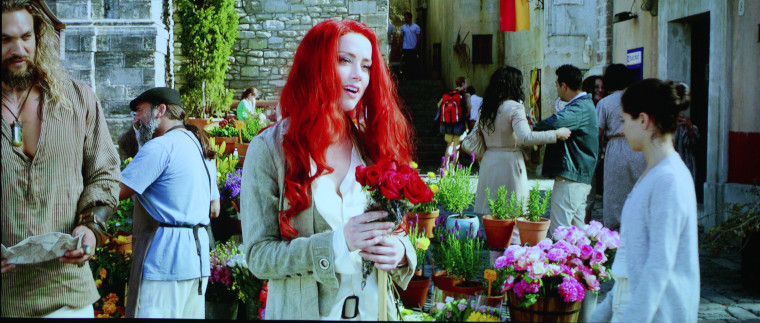
Standard Picture Mode with Eco brightness. Good reds and vibrant color.

Soft Picture Mode with eco brightness is a good choice as well. Here you can see the image still looks good.
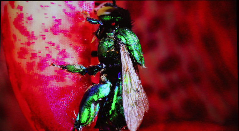
Vivid picture mode with Eco brightness, causes the reds to be too red too vivid if you will.

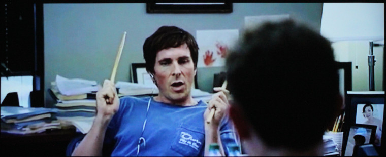
Herewith Jack, even on Standard and Eco brightness, there is some redness in his face.
❮
❯
Axxa 4k1 mini projector delivers rich vibrant LED colors. As I eluded to in the hardware section, there are not a lot of options to adjust them. In the menu, you have 4 picture modes, Standard, Soft, user and Vivid. You will notice that I did not include a picture of the user mode. One big issue I had is that while you are in the menu system, you cannot see your image. So I would pause the blue ray, then it was 7 clicks to the adjustment menu. Yet, if you can’t see what your adjusting, it makes it very difficult. I found my self going back and forth and then just going back to standard.
Standard - My choice for your best image performance. Still red and greens were strong, everyones lips were a little to red.
Soft - I am sure there was a bit of a sharpness adjustment between standard and soft. It was not a noticeable difference. Soft would be my second choice.
Vivid - was a big boost in red and green. This looked good for nature and wild life colors, but made skin tones greenish and lips very red.
Overall some of the colors were strong and overly saturated which causes the red checks and overly pink skin tones. As you can see in the image above, poor Jack Ryan looks like he has a cold with his red nose. Maybe a little fever with his rosy cheeks. This was a general theme. While watching Baywatch the reds were super red and the greens were neon. This oversaturation bled into other colors causing them all to have a tad to much red or green. I will touch on the contrast in the next section.
I found the best viewing mode to be standard picture, with the brightness set to eco mode. Having an LED light engine, to increase brightness, they have to pump our more light, which led to much more green and Red. Not to mention fan noise, but that's another section coming up.