The above gallery shows screen shots with the projector operating in the available color modes. I would note that I found that the screen shots do not fully capture the degree of color balance/accuracy that I observed visually. So the above screen shots only provide an idea of how the projected image appeared in each of the available color modes. Note that the 1st photo is when the projector is operating in its brightest mode, with Eco mode turned off and the light engine set to maximum output. This is not one of the preset color mode, which all operate in Eco mode, and Casio has not given this brighter mode a specific Color Mode name. I found the color balance in all of the preset modes, and also the brightest mode, to be rather cool with an overall blue or blue-green tint. My brief comments on the individual color modes are provided below.
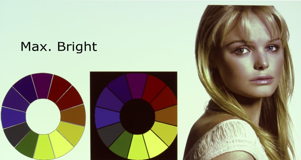
MAX. BRIGHT
The operating mode for the XJ-V1 that produced the brightest image also had the worst color accuracy then any of the projector's preset color modes. This mode is only available when the Eco power mode is turned off. The image had a very strong green tint (or somewhere between green and cyan) and flesh tones were poor. Reds appeared far too dark. Yellows appeared too green and magenta appeared too blue. Overall this brightest mode offered rather poor colors.
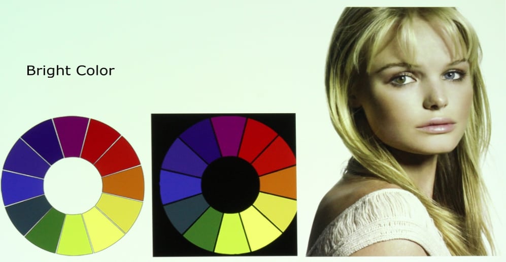
BRIGHT COLOR
This mode is only available when the Eco power mode is turned off. It is the second brightest mode and while the color accuracy is not very good, it has noticeably better color accuracy then the Max. Bright mode, especially when the Color Balance option is set to "Warm" instead of the default "Normal" setting. This mode has a fairly strong green-blue tint with weak reds with a rather "cool" overall appearance. Yellow appears too green and magenta shades appear too blue. Heavy saturated colors generally appear too dark. When extra brightness is needed this mode would be acceptable for many classroom or business applications, but the extra brightest come at the price of less color accuracy than some of the better preset color modes describe below.
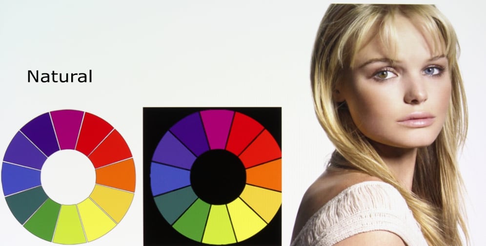
NATURAL
The Natural preset color mode also provided a very cool image with a overall blue-cyan tint. Colors were better than in the maximum brightest mode, but reds still appeared too dark and flesh tones were not very good. While the accuracy of yellow and magenta colors were improved over the max. bright mode, they were still not very accurate.
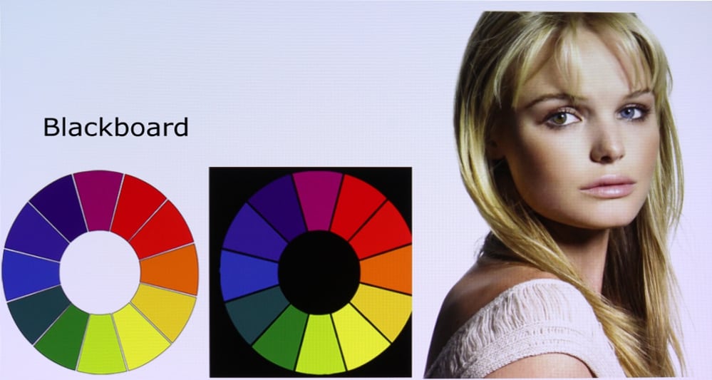
BLACKBOARD
The Blackboard preset color mode is intended to be used when projecting onto a blackboard. The gallery photo shows the image as it appears on a white screen where it had an overall blue tint. I did not evaluate Blackboard color mode when used with intended projection surface.
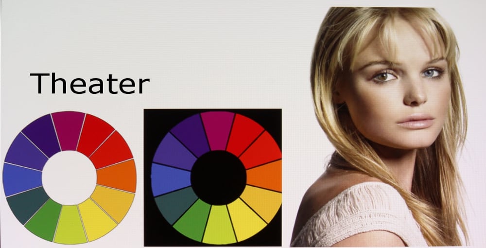
THEATER
The Theater preset color mode should offer the most accurate colors for viewing video. However, I found with the default Color Balance setting of "Normal" the image was too cool with a color temperature of just above 7500K, while the video standard is 6500K. I went back to the "Image Adjustment 1" menu and changed the Color Balance setting to "Warm" which lowered the color temperature to near 7000K which produced improved color balance. With this setting the colors appeared reasonably good with yellow and magenta much improved over the above discussed color mode. However, I did note that brightness of certain shades did appear either too bright (e.g., blue) or too dark (e.g., red).
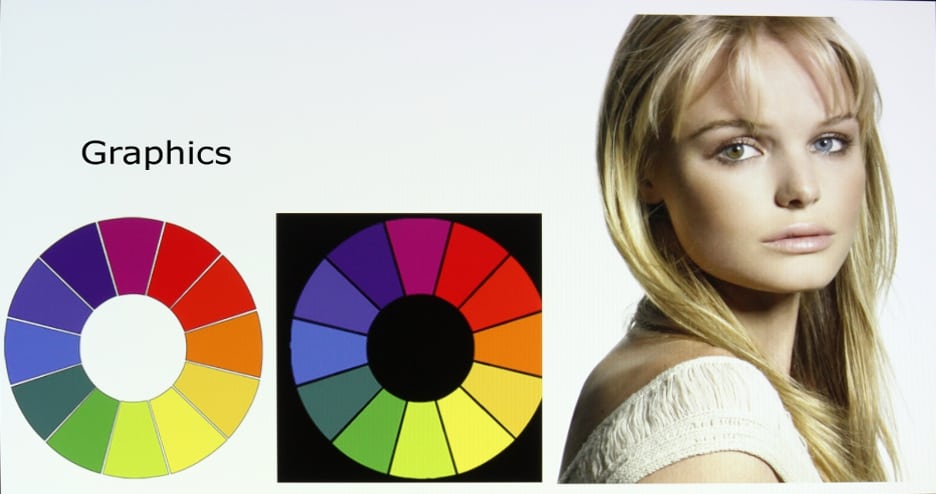
GRAPHICS
The Graphics color mode had similar color accuracy to the Theater mode with the factory default setting. The image was too cool but was still more accurate then some of the other modes.
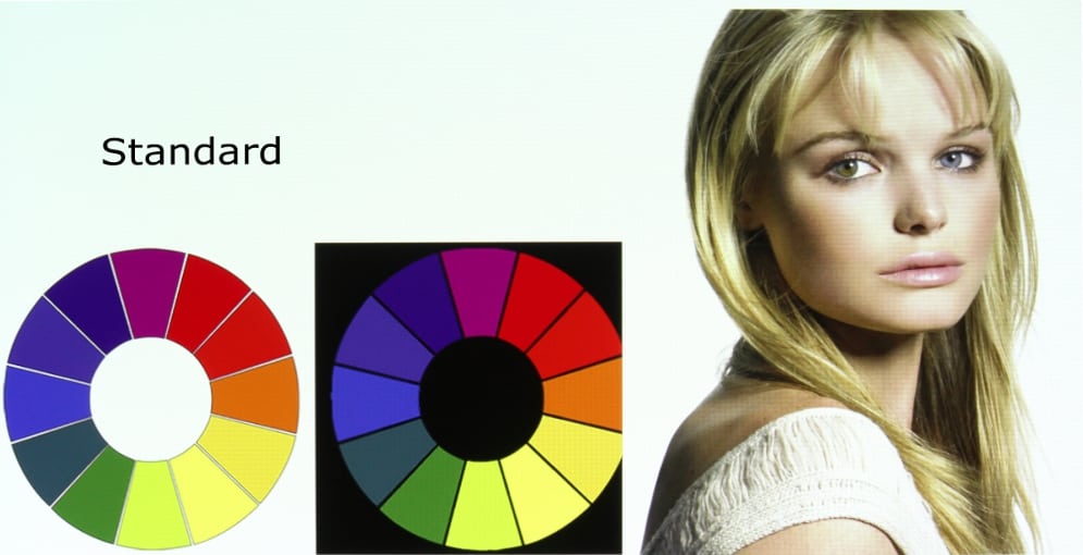
STANDARD
The Standard color mode has a very cool appearance with a high color temperature. Color accuracy and overall appearance was similar to the Natural color mode.
[sam_pro id=1_83 codes="true"]
Video Picture Quality
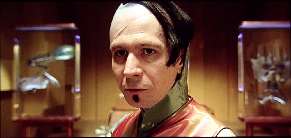
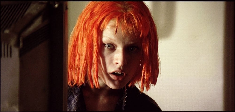
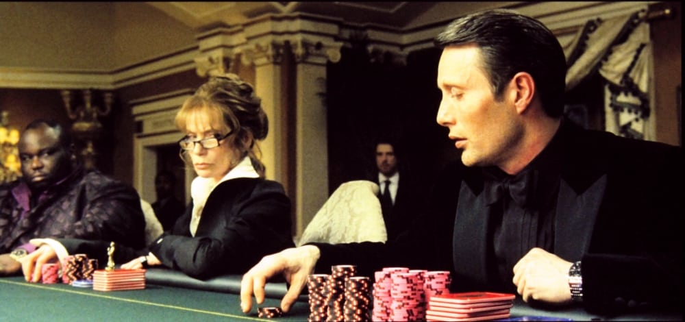
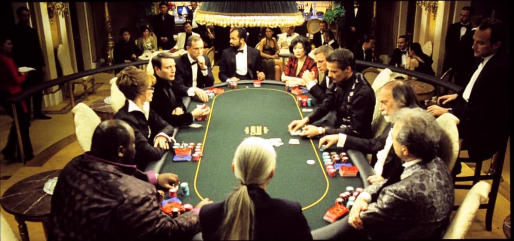
The first 6 photos in the above gallery are screen shots from the movie "The Fifth Element" and the final 6 photo are screen shots from the movie "Casino Royale".
For evaluating the picture quality when projecting video I used the projector's Theater preset Color Mode with the Color Balance set to "Warm". Also I adjusted the brightness setting to +4 and the contrast setting to -4 to more accurately display the reference black level and reference white levels respectively.
With the above settings I would rate the overall picture quality was fairly good, for this class of projector (education/business). The image had good contrast and sharpness was good, considering the projector's only offers 1024 pixel horizontal resolution and because of the 4 x 3 aspect ratio of the projector, only about 430 pixels are being used when displaying a widescreen 'scope' movie. Fleshtones lacked a little of the warmth I would expect to get from a projector offering more accurate colors, but overall the picture quality as just fine for this projector's intended use in a classroom or conference room where there may be a need to show videos from time to time.
Since this projector has no internal speaker, a external powered speaker(s) will be needed for reproducing the audio track that accompanies the video program. The projector has a standard mini-phone jack on the rear panel for the audio output. A power speaker, as might be used with a PC or mp3 player, could be used as long as it is capable of supporting the volume level need for the intended classroom or conference room size.
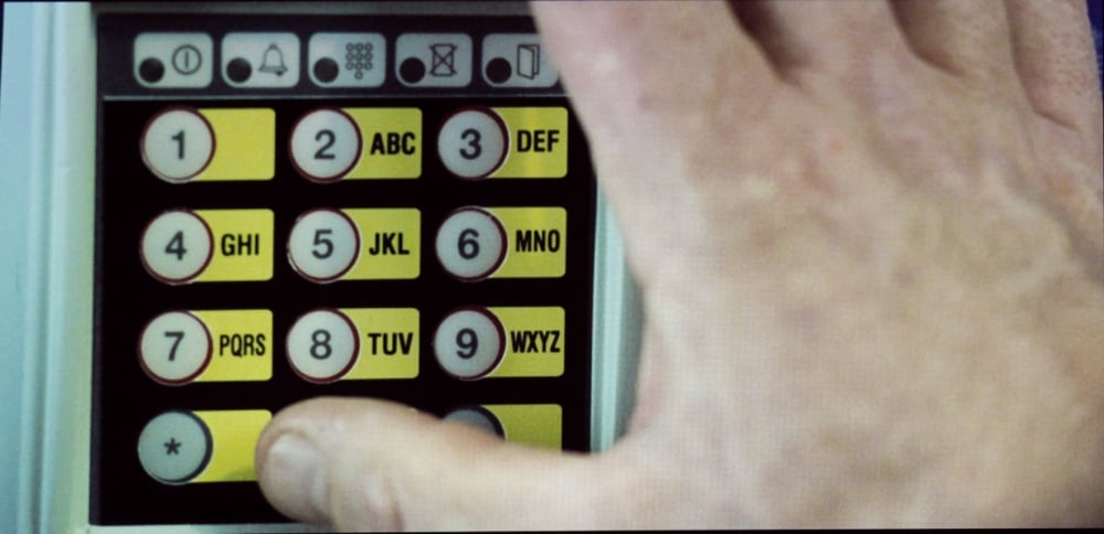
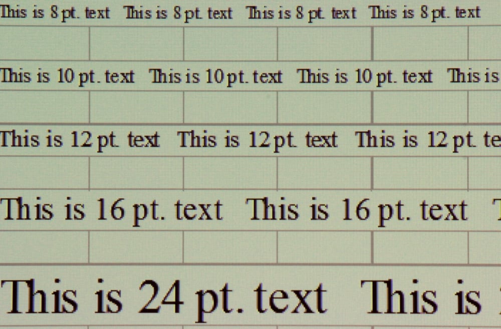
Text Image Quality
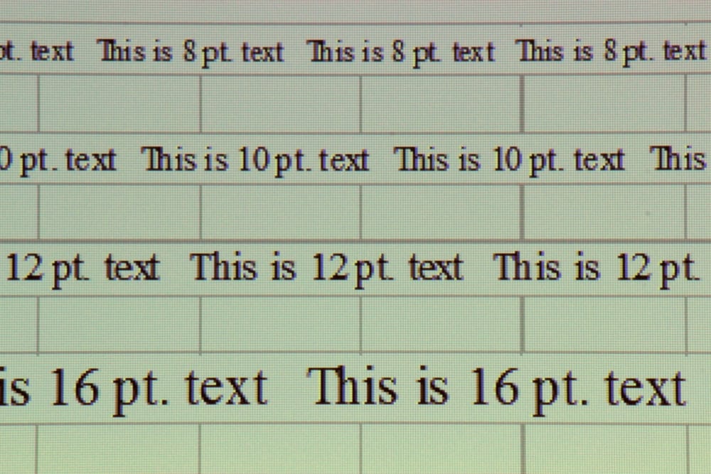
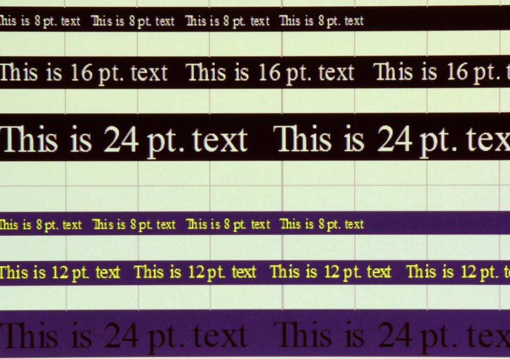
The EcoLite XJ-V1 has very sharp focus and being a single chip DLP projector there is no possibility for misconvergence that can soften images on projectors using separate display chips for the red, blue and green primary color (e.g., 3LCD or LCoS). Also the lens did not produce any noticeable color fringing. As a result, the overall sharpness of projected image was limited only by the projector's native 1024 x 768 resolution. Sure its a little lower resolution than the 1280 x 800 resolution found on some competitor's business or education projectors, but I found the text readability to be as good as what I have seen on several of those other projectors.
The one issue I observed is showed on the bottom line of text in the 3rd gallery photo above. The Black Text on a blue background was difficult to read and the projector's available adjustments offer little improvement for making the text more clearly stand out from the medium-dark blue background. Most classroom and business projectors do a little better for this one specific case. But other than this one rather extreme example, the XJ-V1 scores very well for text readability.
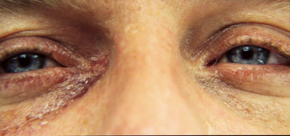
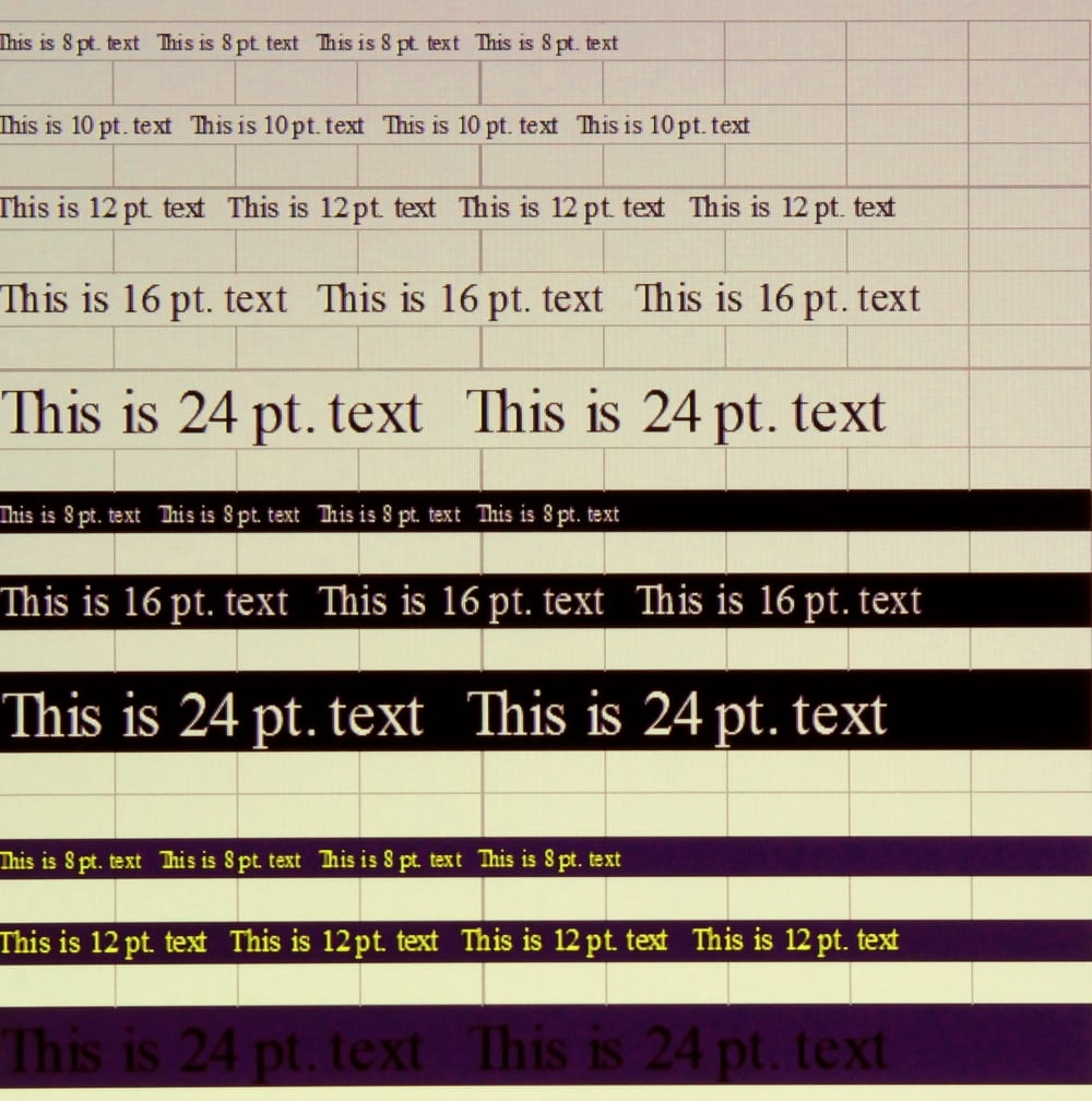
I also checked how well the EcoLite XJ-V1 performs when scaling higher resolution images down to the projector's native resolution. I input the text test image at the maximum resolution the projector can accept and the result was still very good text readability, as shown in the close-up screen shot below.