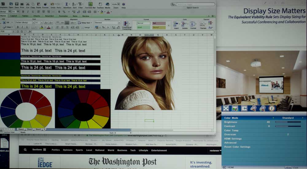
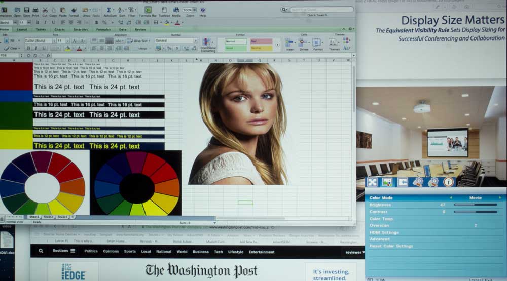
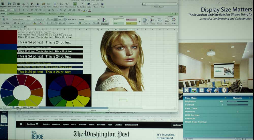
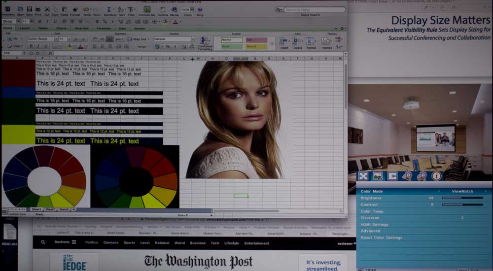
Picture Quality - Right Out of the Box
There are two Color modes with very good color right out of the box. Movie, and ViewMatch. In fact they are very similar, but there is a slight color shift difference between them. You can get a good idea from our test images showing each of the modes. The PJD7835HD offers modes that can do a great job either for business presentations and collaboration or in your home for movie, sports and general HDTV viewing.
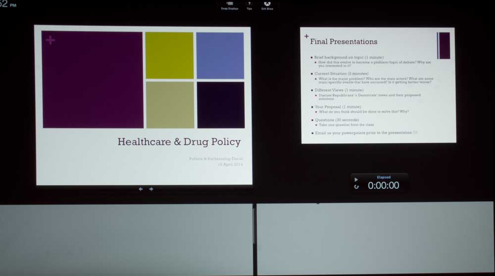
Powerpoint Presentation in practice mode
And the PJD7835HD does have full calibration controls should you have a need for near perfection.
More on ViewMatch vs Movie: That they should be very close to each other makes sense:
ViewMatch, which you can guess at by the trademarked name itself, I believe it is geared to follow sRGB, which long ago was created as a standard. It would work so that if the folk bringing you an image online, calibrated to sRGB, and your monitor is also calibrated to it, you should end up with the same color as intended. That was always a good idea, so that, for example, you could view a clothing site, or an art gallery and get a very good, accurate idea of what that shirt, dress, or painting will look like. sRGB has been around a long time, and while it differs slightly in some ways, is very similar to REC 709, the standard for HDTV color.
[sam_pro id=1_53 codes="true"]
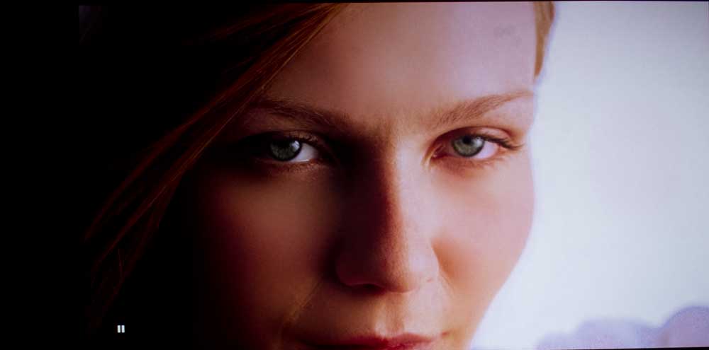
In addition to the multiple Mode images and an assortment of browser, and even a couple of powerpoint images, you’ll find photos of movies and assorted HDTV, to get you a good feel for the color capabilities. Remember of course, any projected image looks much better than our attempts to capture it and show it to you, since there’s my pro dSLR, the process of image sizing, saving with tons of compression, and of course, your monitor’s color inaccuracies whatever they may be, standing between the projected image and any attempt to perfectly reproduce it on your display.
Missing from the test images above is "Brightest" mode, which measured slightly brighter than Dynamic but, it's color was not as good (more yellow green). Notice, though, Dynamic mode, where bright reds come out dark red, and yellows are mustardy. That is true for the mode "Brightest" as well as Dynamic. The less bright modes do better, because then we're getting down to brightness levels where there are enough color lumens to match the lower white lumens.
Overall, the various modes produce good to extremely good color, the brightest mode as is typical of almost every projector, tends to have a bit too much green. That is visible in its photos, as you can see. In the two brightest modes, however, on our test pattern, you can see the end result of a good projector that doesn’t have as many color, as white lumens:
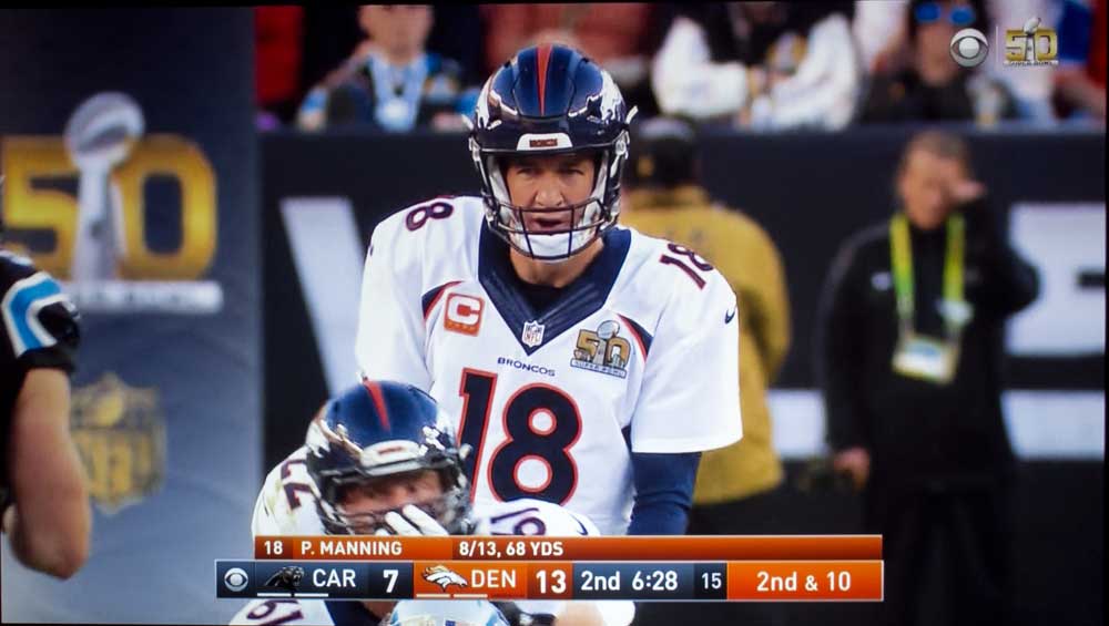
Handling of Skin Tones on the PJD7835HD
Whether you are using a projector or other display for business, education, or entertainment, skin tones are normally a great indicator of overall picture quality. If skin tones do not look good, then almost anything with photos or videos will also probably not look great.
I consider the Viewsonic PJD7835 to be a true crossover projector, one expected to be used both in business / education environments, but one that will also find its way into the home. Certainly its got the bells and whistles to do both.
Thus our interest in how well this Viewsonic does skin tones.
Check out these skin tones images, whether Movie mode viewing the woman on our spreadsheet test image, or skin tones captured from movies such as those of Bond, or Katniss from The Hunger Games. Even the Gamma looks pretty good in Movie mode, and those skin tones look just about right in terms of gamma.
Now mind you, the Viewsonic has Brilliant Color. Crank up Brilliant Color (and the image gets more contrasty, while delivering more brightness. Brilliant Color, it could be said, is a series of adjustments to add more Pop to the image. As a result, full on 10 isn’t as natural as the lower number settings. When you are in Movie mode, Brilliant Color defaults to 6, the lowest setting of any of their modes. (ViewMatch is at 7, and the other three modes are all set for 10 for maximum impact, at the expense of a bit of naturalness. Standard, btw, the least bright mode has Brilliant Color defaulting to 5.
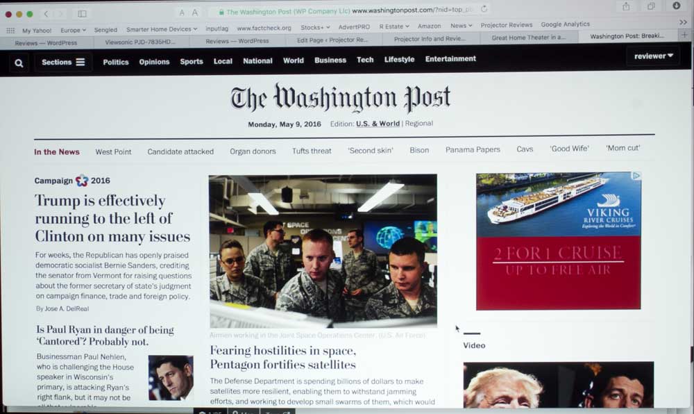
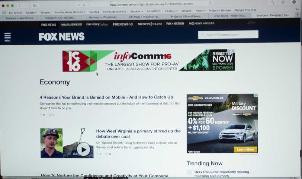
Presentations
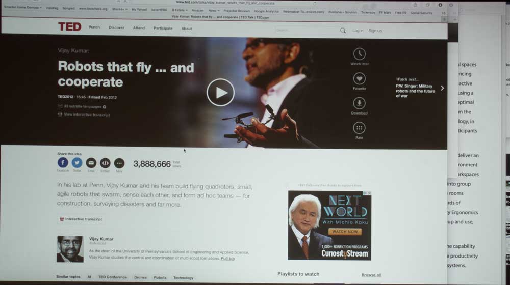
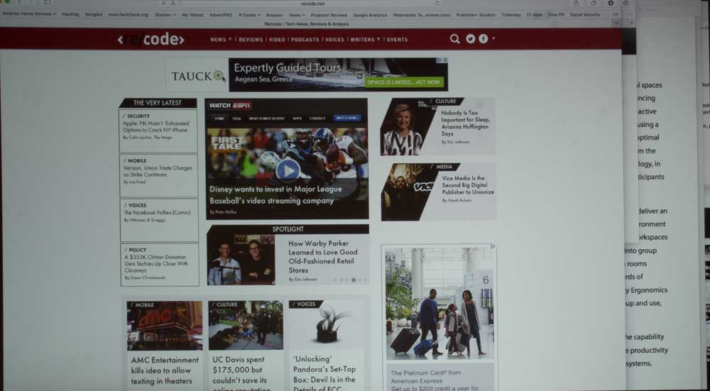
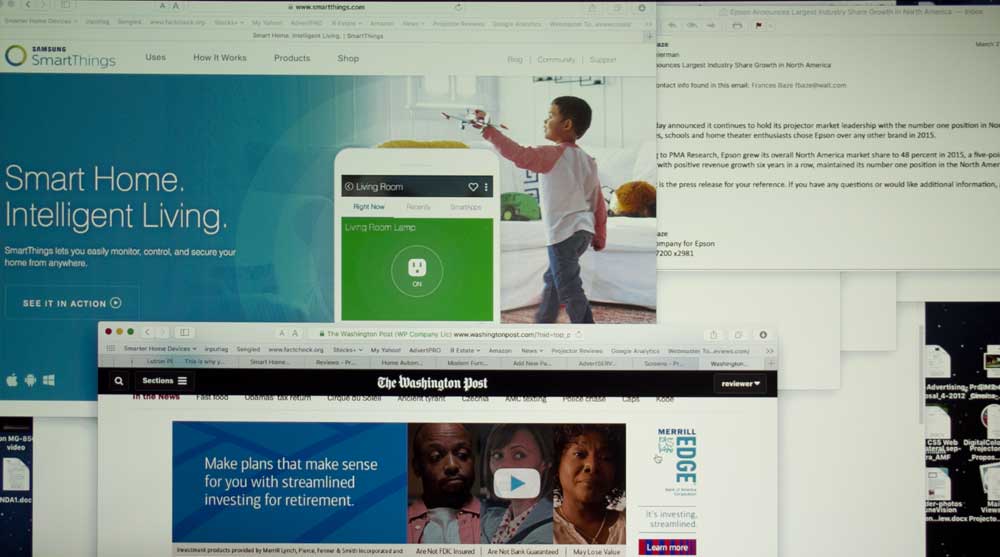
Rather than showing you just large PowerPoint type presentation images I've assembled a variety of web pages, and presentations, but the presentation shots are of the presenter's computer screen (so smaller type, other info).
All considered, the Viewsonic handled everything with a nicely vibrant picture in almost any mode. the more Brilliant Color, the more pop to the image, and the more lumens (brightness).
There's the standard trade-off of better color (particularly reds and yellows) in the less bright modes, vs. more overall brightness but not as good color. As I said before, those trade-offs are standard stuff for single chip DLP projectors.
Overall, I would have to say that this Viewsonic does a fine job on presentations, displaying typical documents (including emails) or websites.