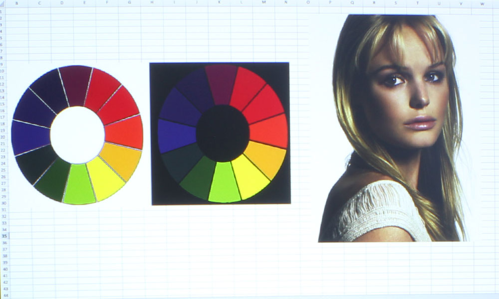
The Casio XJ-S400UN has seven color modes: Standard, Graphics, Theater, Blackboard, Natural, Vivid, and DICOM SIM. Of those color modes, I would consider only a couple to have good color, with all others ranging from decent to not so good. It’s been a while since I’ve encountered a projector where I wasn’t completely satisfied with at least one of the color modes, so this should be fun. It’ll be good for you to read a review of mine where I’m not raving about the color.
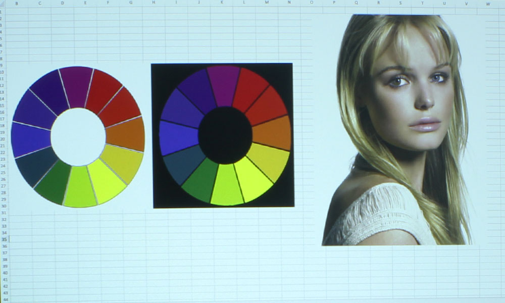
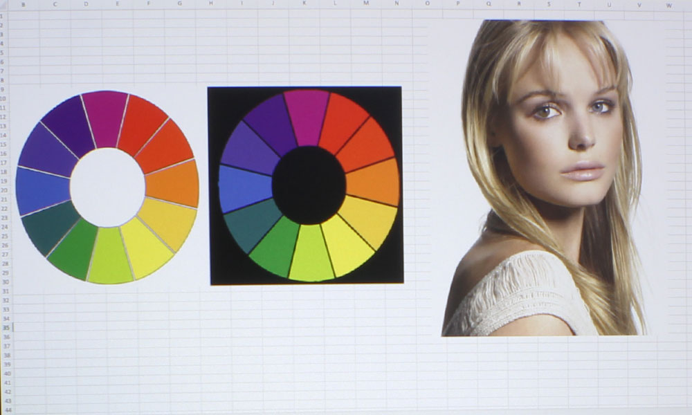
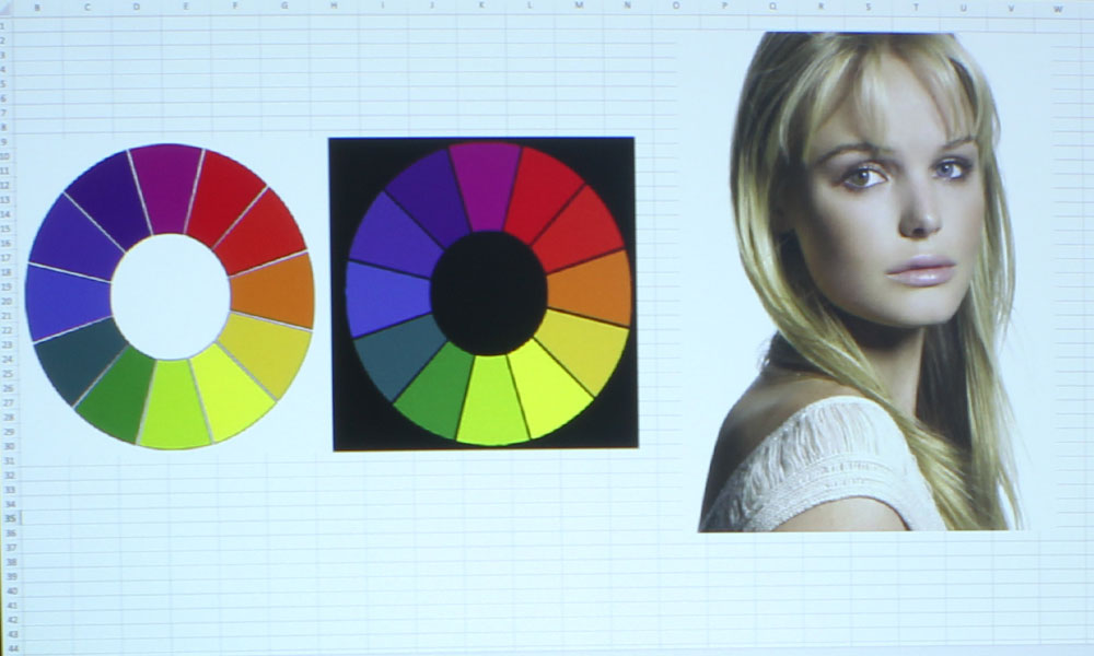
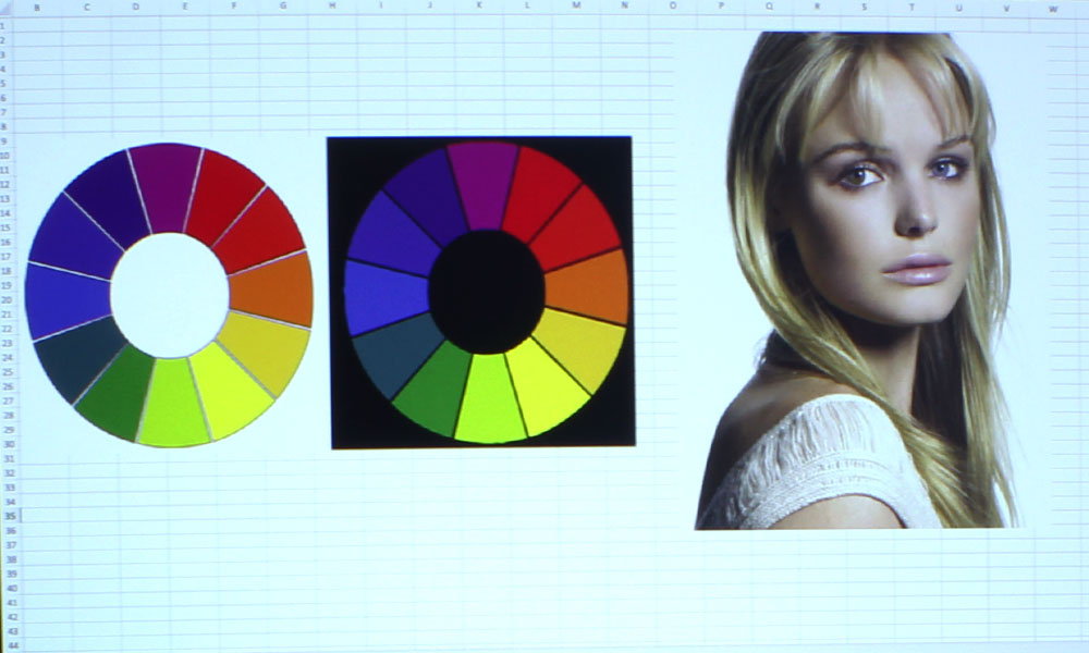
That said, the two “best modes” are Theater and Natural. Theater has the best performance in terms of skin tones, while Natural is, in fact, the most natural-looking all around. Theater, like most other projectors’ modes of a similar name, has a more magenta hue than the others. This is what gives skin tones their natural look. I would choose Theater for films and educational shows where skin tones will be present, and Natural for presentation and other graphics. But, I’d like to point out, that neither of these modes are particularly true-to-color out of the box, and could do with some tweaking in the settings.
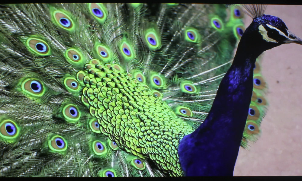
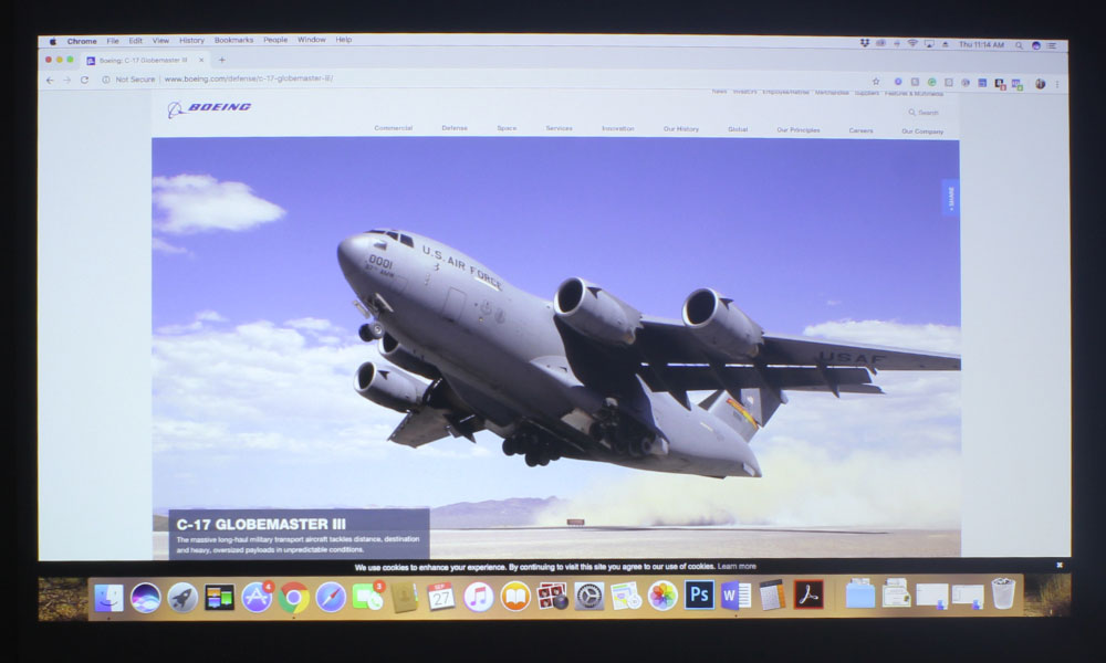
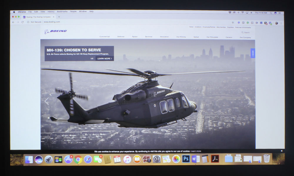
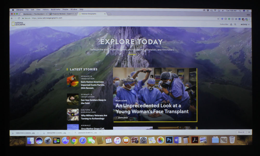
Vivid is aptly named, as the contrast of the colors is intense. It made the blue menu of my PlayStation QUITE blue, and I found it to be a bit too much. That isn’t to say it won’t work for someone else’s applications, but I did not choose to use it for any of the photos in this review. What you’ll see throughout this review are photos taken in the Theater and Natural modes. Vivid has a very cool tone, and could look good on certain graphics where color isn’t of the utmost importance.
Graphics mode also has a cooler tone, though not so much as Vivid. It, too, could be used for some graphics or presentations where accurate color isn’t needed, but I would choose Natural over either, every time. Blackboard is always going to be strongly magenta, no matter what projector you’re looking at. This is because that hue, when projected on a blackboard, allows for more natural-looking color. Standard, which is the brightest mode, is your “break glass in case of emergency” mode, only to be used in the most dire cases of uncontrollable ambient light, due to its sickly green/yellow hue.
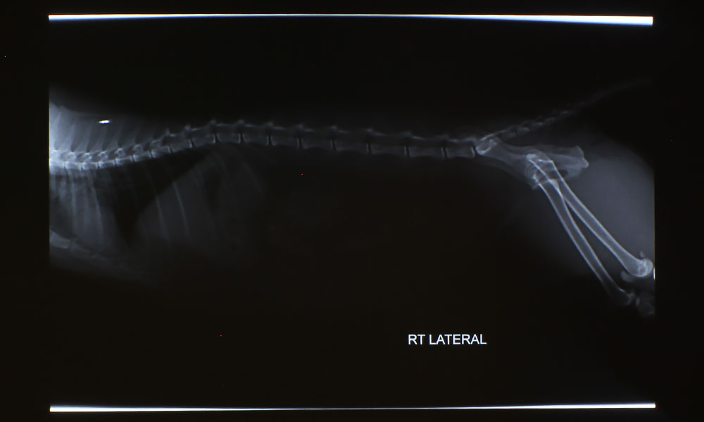
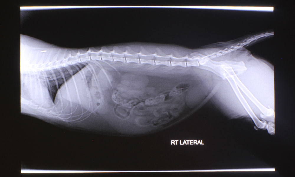
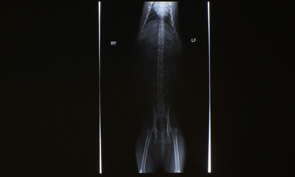
DICOM SIM. is the mode I am most disappointed in. DICOM SIM. is used for viewing high contrast films, such as X-Rays and MRIs. When I projected the X-Rays I have of my kitty’s stomach, I couldn’t see any of her organs. DICOM SIM. is supposed to make these X-Rays easier to view, but in the case of the Casio XJ-S400UN, it rendered the X-Rays useless. Good news though – when I changed the mode to Natural, I was able to see all of her organs extremely well. I have included photos of both modes for you to compare, in the slider below.