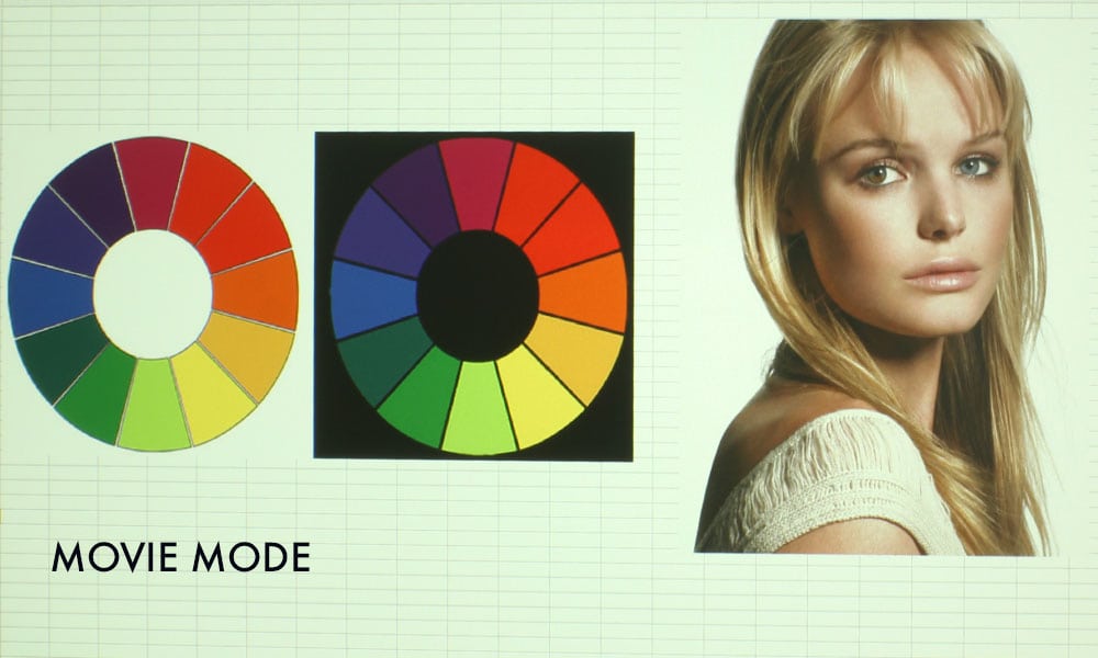
Optoma ProScene ZU660 Color Mode: Movie
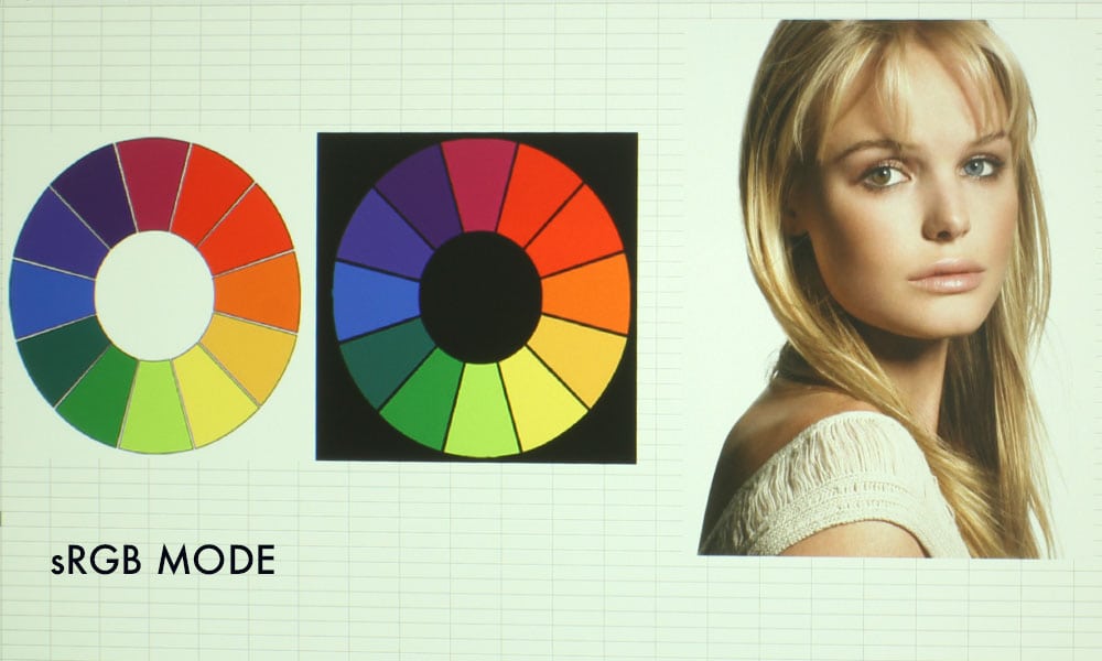
Optoma ProScene ZU660 Color Mode: sRGB
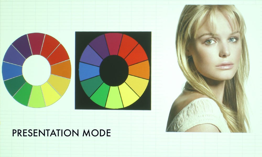
Optoma ProScene ZU660 Color Mode: Presentation
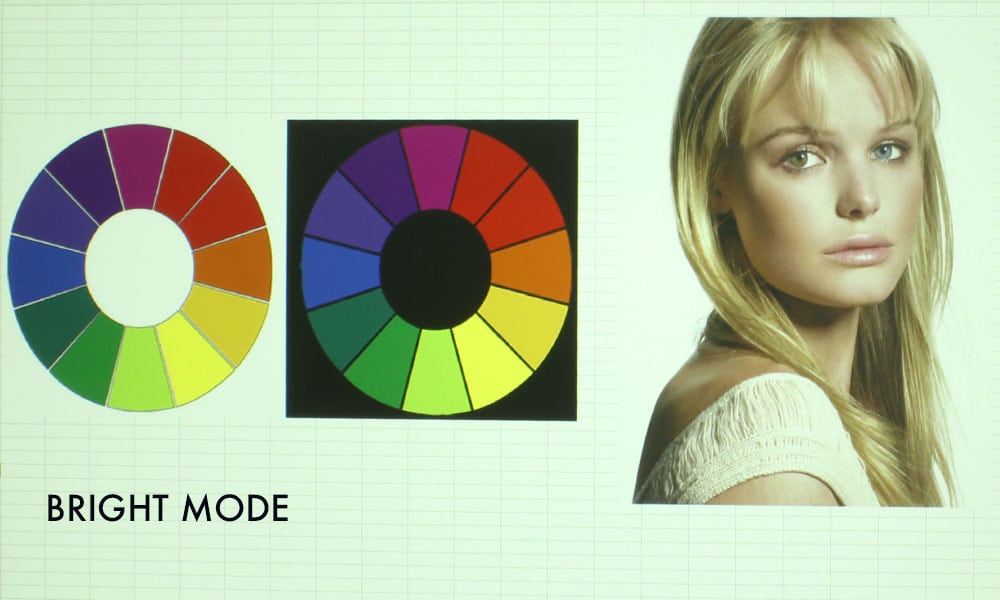
Optoma ProScene ZU660 Color Mode: Bright
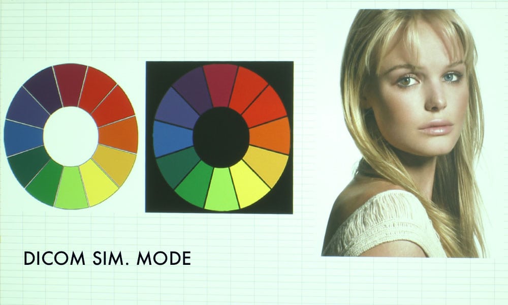
Optoma ProScene ZU660 Color Mode: DICOM SIM.
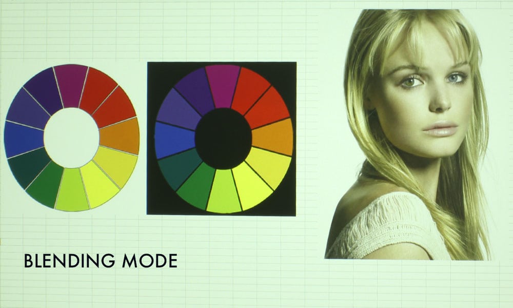
Optoma ProScene ZU660 Color Mode: Blending
❮
❯
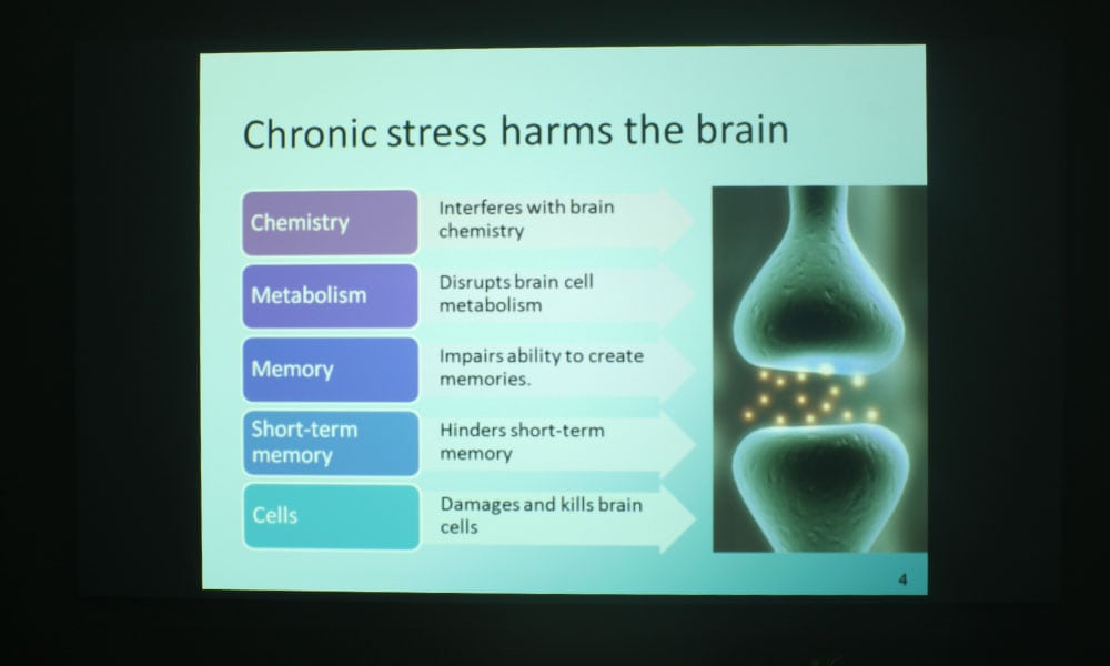
The Optoma ProScene ZU660 has six color modes: Bright, Presentation, Movie, sRGB, Blending, and DICOM SIM. Bright Mode has strong greens and yellows, wine reds, and mustard yellows. The strong greens and yellows are typical of a brightest mode, while wine reds and mustard yellows are commonly found on DLP projectors.
Color improves on Presentation Mode, with more magenta being added, so skin tones look much better than those in Bright Mode. Still strong on the greens and yellows, with blues suffering slightly – becoming more turquoise in color – but overall, there’s a great improvement in this mode. Quite suitable for presentations and websites.
Movie Mode and sRGB Mode, the two “best modes,” are similar in color. Both greatly improve on Presentation’s color, with skin tones looking rather excellent, thanks to added red and magenta. I did notice on the photos taken in these two modes that the color wheel’s reds are impossible to tell apart. This is no home theater projector, however, so I wouldn’t count that as a negative against the ZU660.
The next mode, called Blending, is just ugly. It’s greener than Bright. It is the second brightest mode, and used for Image Stacking. If you want better color, you can use the projector’s CMS and HSG Color Matching to compensate. Though, I favor Bright Mode over this one. The final mode is called DICOM SIM. and is used for viewing high-contrast films like x-rays, such as in higher education medical classrooms and lecture halls.