Image Quality
The averall picture quality for all of the preset image modes was good or better. The projected images were very sharp and the colors were fairly accurate in all image modes. Below is a summary of the colors for each of the preset modes.
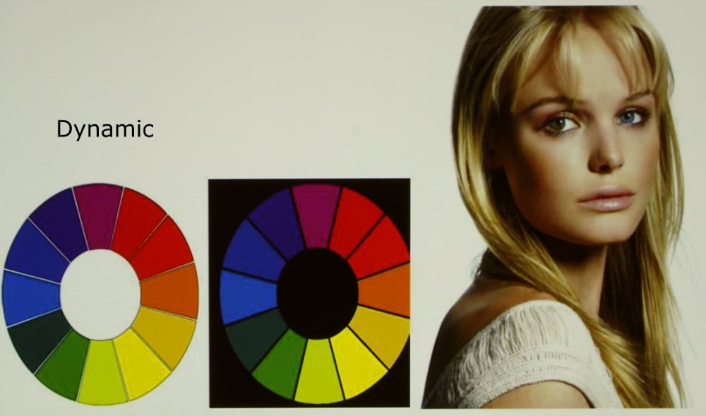
Dynamic image mode was the brightest of the presets. It produced images that for the brighter areas had a warm appearance while for the darker areas of he image the colors were cooler. When looking at skin tones they tended to be fairly natural but a little too red when well lighted but a little anemic (i.e., with a slight blue overall color shift) in darker lighting. This indicates the color temperature moved from higher to lower as the brightness of the image increased from near black up to white. I found the whites had a slight yellow appearance. Also color of green objects appeared shifted a little toward yellow (the was true with all of the preset image modes).
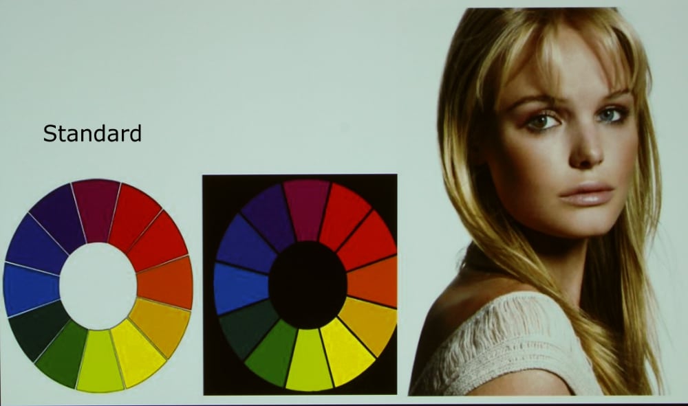
Standard image mode was fairly good as far as colors go and somewhat better than dynamic mode. White appeared neutral without an obvious color tint. Skin tones looked natural but a little too cool in dark lighting. As with the other modes, green objects has some shift toward yellow.
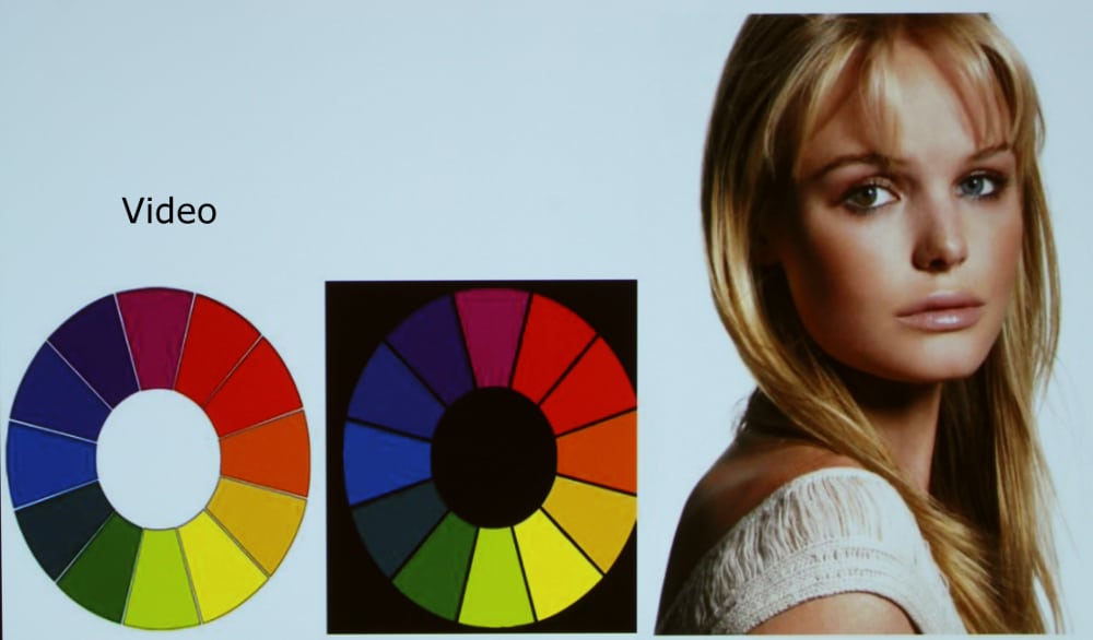
Video image mode had fairly consistent color balance as the image brightest increases from near black up to white. Overall the image was a little cool and skin tones were reasonably good. I noted that in this mode the whites were neutral and yellows appears a little more accurate than they do in Dynamic and Standard mode. Again greens showed some shift toward yellow.
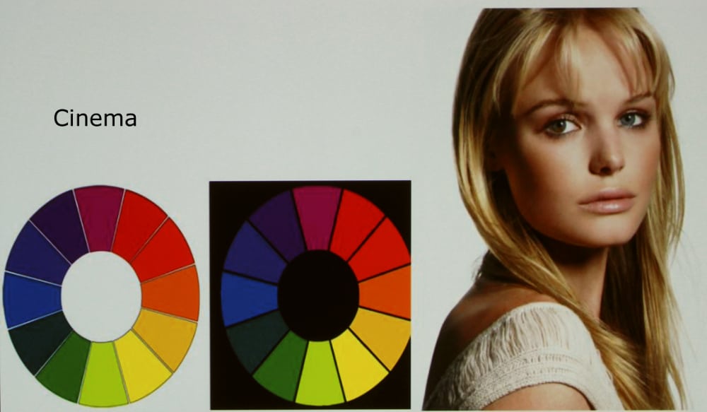
Cinema image mode was actually tied as the 2nd brightest preset image mode. While the above modes produced images that frequently appeared a little too cool, the Cinema mode went the other direction producing images that were generally a little too warm. Skin tones were a little too red, but were fairly consistent from darkly lighted up to brightly lighted images. Whites were neutral and most colors appears fairly accurate, with the same situation of green objects having a little shift toward yellow.
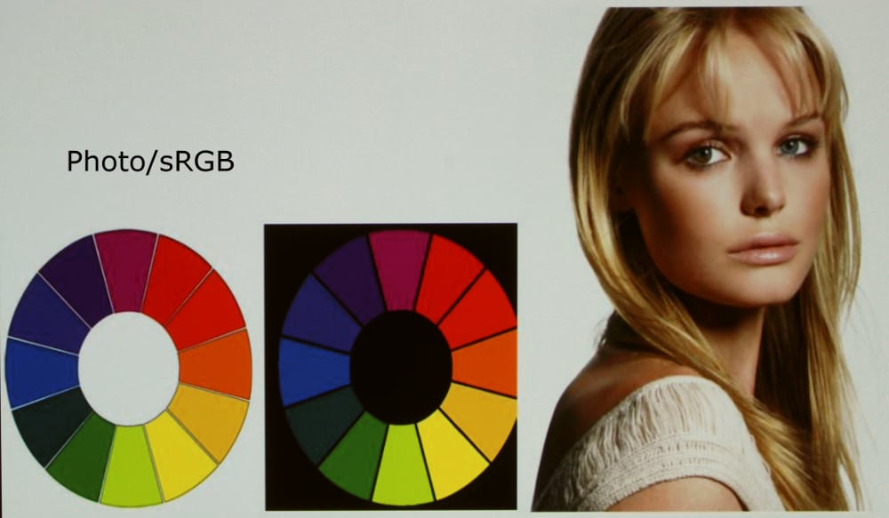
Photo/sRGB image mode was very similar to Cinema mode with the same image brightness and almost identical color performance.
Note that the WUX6000 includes a complete set of adjustments for color balance, grey scale and color management that could be used to improve the performance of any of the above described image modes. However, for our reviews of business and education projectors we do not normally attempt to calibrate them for more accurate images.
[sam_pro id=1_96 codes="true"]
Video Picture Quality
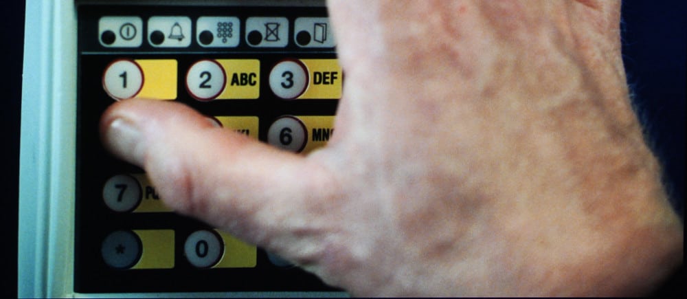
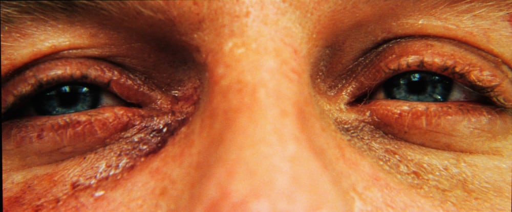
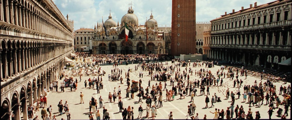
The gallery above shows screen shots taken when playing the movie Casino Royale on the WUX6000 in the preset Cinema image mode. Overall the image was good to very good, especially for a business installation class projector. I first used the factory default picture settings (used for these photos), then I adjusted a few of the user settings to produce a more accurate image.
This projector uses LCOS micro-display technology and it delivers better contrast and darker blacks than most 3LCD based business or education projectors. Canon rates the native contrast ratio at 1000:1 (I measured 1300:1 in dynamic mode). While most 3LCD business/education projector may spec. contrast ratios of 5000:1 or higher, this is not the native contrast ratio and employs lamp dimming and/or a auto iris to reach such values. However, these 3LCD models typically have a native contrast ratio of under 500:1 and in the real world LCOS and DLP models will produce a picture with better contrast when viewed in a dark room. While not up to home theater projector performance for contrast and black levels, the WUX6000 does have better performance in these areas than 3LCD business/installation class projectors and it is competitive with DLP business projectors.