Out of the Box Picture Quality
Since we calibrate all home theater projectors we rarely take photos of the projector pre calibration. In this case, that would have to be considered to be a very good thing. Right out of the box, this HD91 definitely does not have good color. Faces and most things suffer from over saturated reds.
We're talking over the top, not subtle at all. I'd go as far as saying that, without adjustments, and assuming this HD91 is typical of all HD91 projectors, if you decide that the HD91 is for you, get it calibrated, or try our settings, but you are unlikely to be very happy using the defaults. None of the modes was particularly watchable without adjustment.
The good news is that the Optoma HD91 has a complete set of color controls. And, using an LED light source it also has some impressive color gamut range, which is to say, it's definitely capable of reproducing the usual color standards such as REC709.
But the responsibility is yours, simply because, it seems like Optoma just didn't manage to create even one color mode that looks pretty great.
Mike, of course calibrated the Optoma HD91 projector, as he has something approaching 100 home projectors for us. (He should be getting pretty good by now.)
As it turns out, Mike's calibration made a dramatic improvement, but, as I had feared, calibrating an LED light source projector might be challenging. With the wider gamut, there are probably more ways to approach the calibration. If you have a top calibrator doing your projector, that calibrator will want to keep tweaking until the projector not only measures really well, but looks really well. Here, it'ss more of a perform the full calibration, and give it back to Art to review, without any additional "hmm, this looks better, and is similarly accurate, to what the gear recommends". In other words, Mike's calibrations are accurate, but not always the best, most natural looking picture results.
That's the case for the HD91. The massive red problem is gone, but I find that skin tones are still not great. So, let's talk skin tones:
Optoma HD91 Skin Tones
I've logged at least 30 hours on the HD91 so far. Most of that has been movies. (OK, a few hours of hockey, and NBA basketball too, as well as music concerts off of HDTV).
After Mike's calibration skin tones looked drastically improved. The "But" though, is that they still didn't look great. Before I describe, I remind you that in some reviews I report that for whatever reasons, my Canon 60D DSLR does not always do near flawless reproduction of the colors seen on the screen. I suspect there are a few possible reasons, and in the case of some solid state light sources, their inherently larger color gamut, and possible differences in how the camera is affected by "color" on the screen that's not visible to the eye (perhaps near infra-red or near ultra-violet electromagnetic radiation hitting the camera's sensors), affects the results.
The bottom line, is that post calibration skin tones sometimes look thin on reds, or rather a touch strong on greens. I'd best describe as saying that skin tones sometimes seem grayish.
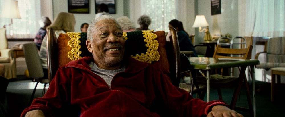
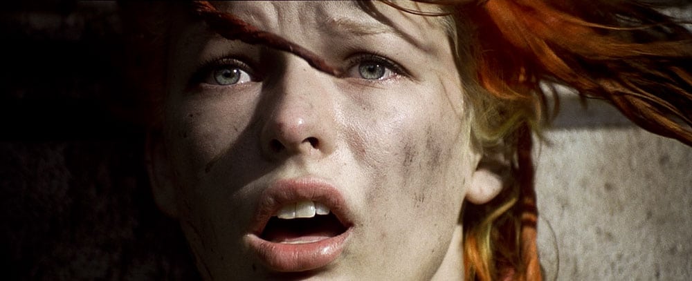
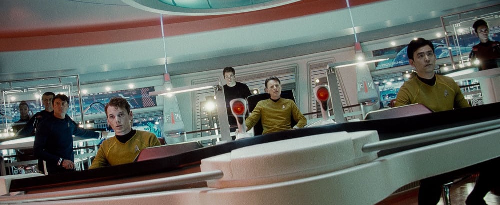
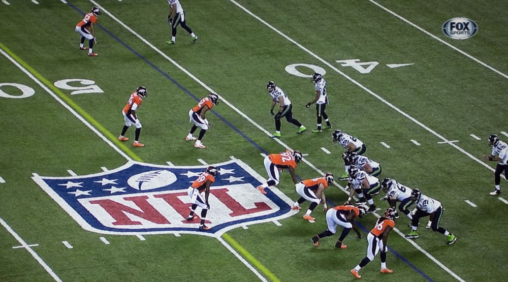
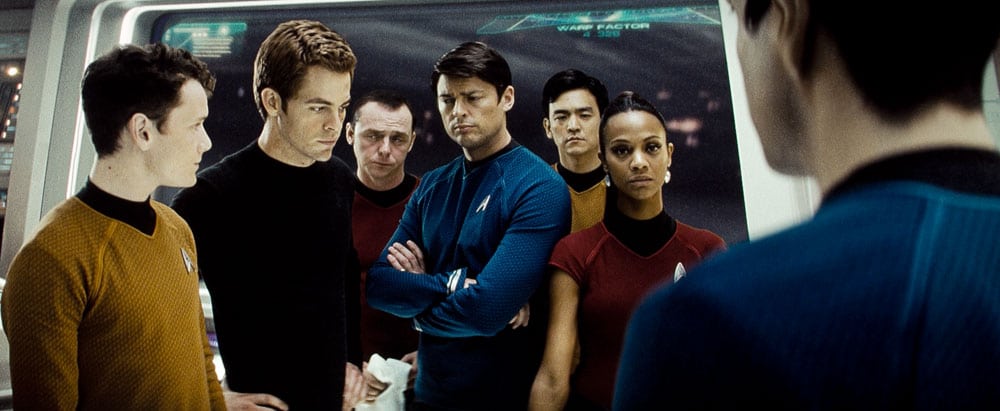
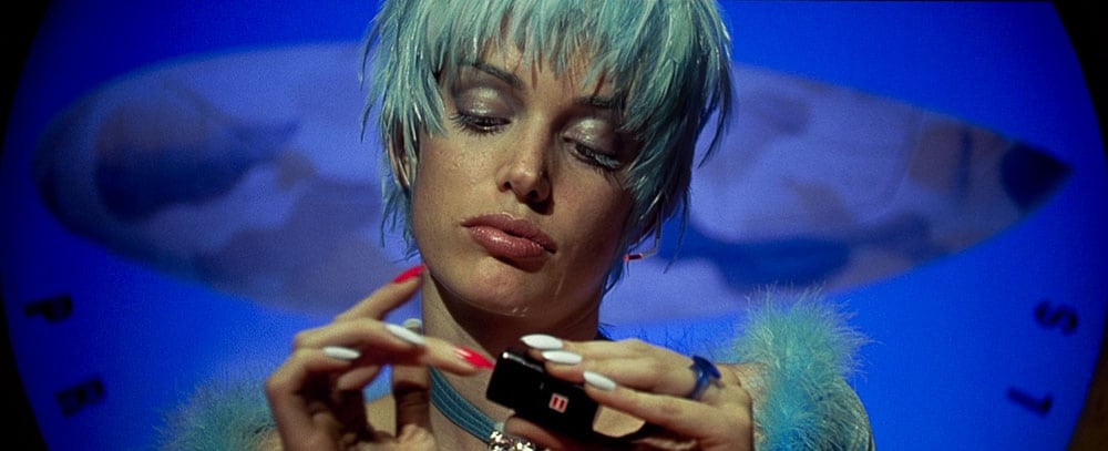
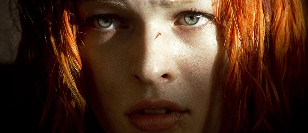
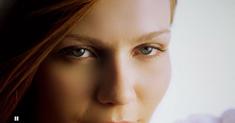
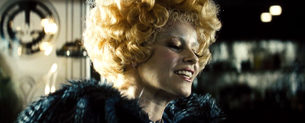
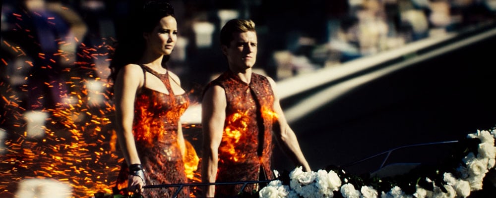
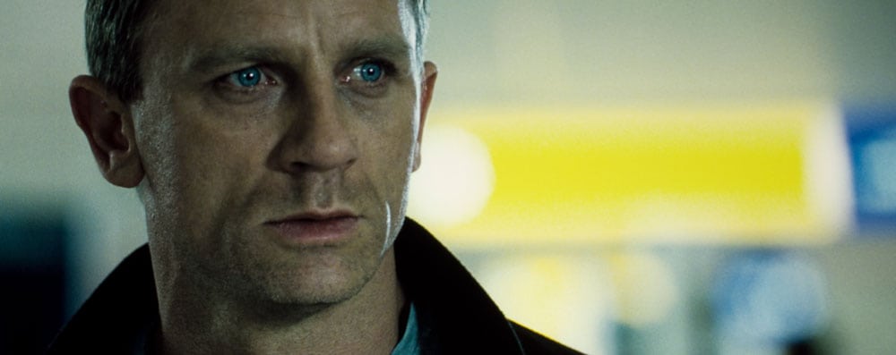
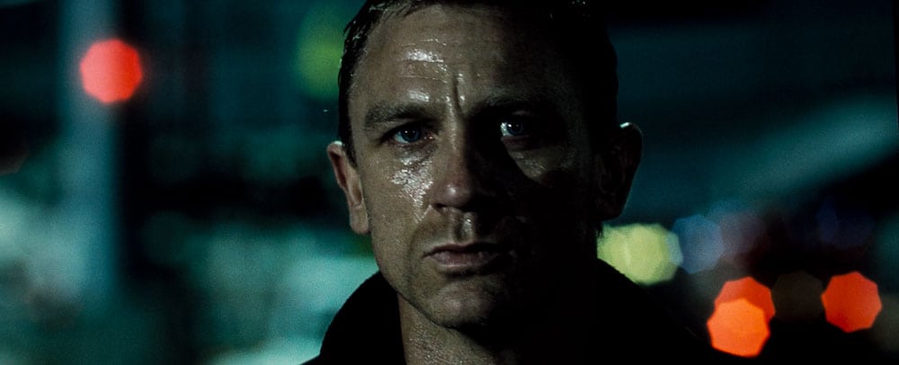
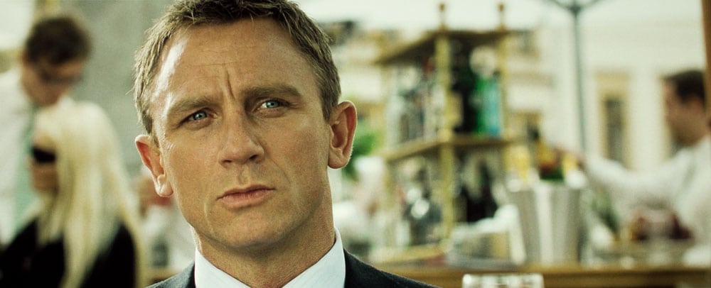
When I watch a lot of content its not noticeable, that is, I'm happy viewing the content, but on other content, I do notice. In the images above, you can see what I mean. Skin tones from The Hunger Games look pretty good, but not so, some of The Fifth Element skin tones, or Bond, where that "look" I just described is more obvious. Interestingly, I found that in the photos the skin tones in general tended to look a touch better (touch more red in skin tones) on HDTV photos than from Blu-ray.
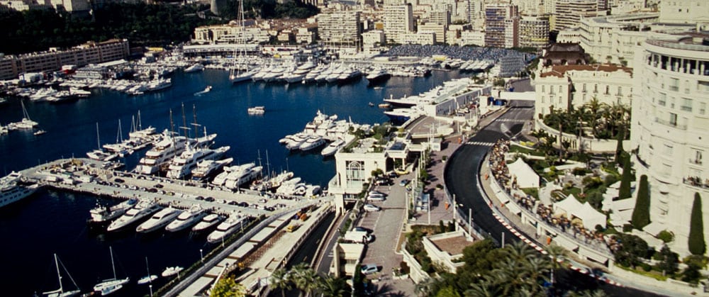
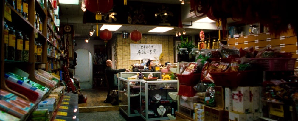
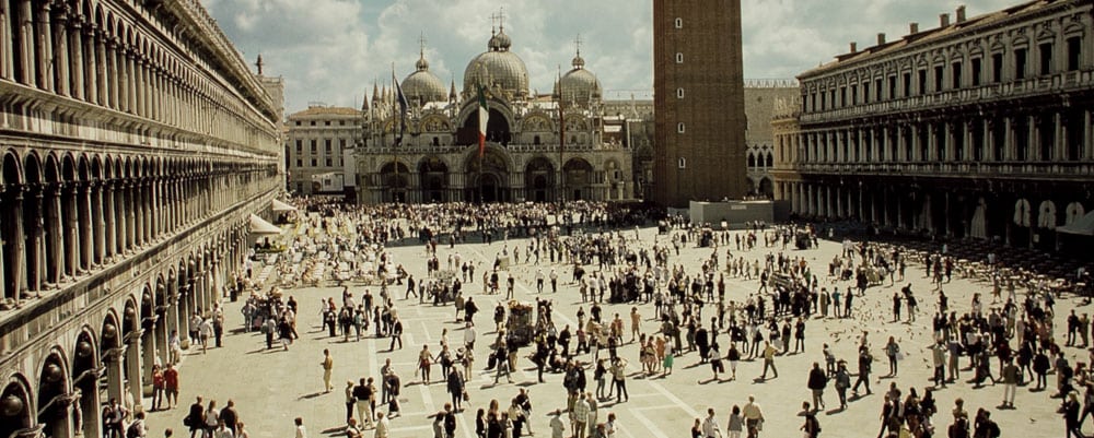
The last four images are the usual ones from Casino Royale, demonstrating that skin tone color is always, and often dramatically affected by the lighting and director's intent. In this case, four photos of Daniel Craig - James Bond, first in sunlight, then fluorescent, then at night, and finally with indirect sunlight.